Theme Settings
Overview
Use Theme settings to customize the store's typography, colors, cart, social media, and more.
The Theme settings menu provides controls for adjusting the Mind theme's settings. For example, you can use the color schemes to adjust the color groups used in the theme, or map each light color scheme to a dark one for dark mode. Mind groups its theme settings into 22 sections, described below in the order they appear in the editor.
Adjust a theme setting
To adjust a theme setting, follow these steps.
-
On the store's admin page, select Online store from the side menu.
-
In the Current theme area, select Customize.
-
From the customize theme menu, select Theme settings. Depending on the size of your device's screen, the menu is on the left or right side.
-
From the Theme settings menu, select a menu section.
-
In the expanded menu section, select a setting to adjust.
-
Adjust the settings.
When you're finished adjusting the theme, to avoid losing unsaved changes, select Save at the top of the Theme settings menu.
Mind theme settings
1. Logo and favicon

Use Online Store > Customize > Theme settings > Logo and favicon to customize your store's logo and favicon.
- Default logo: Select the main logo image for your store.
- Inverse logo: Select a logo variant used when the header's transparent background is set to Inverse (for example, a light logo over dark hero images).
- Favicon: Select an image to use as your store's favicon. The maximum image size for a favicon is 32px x 32px. Uploaded favicon images that exceed these dimensions are scaled down.
2. Colors

Use Online Store > Customize > Theme settings > Colors to set how colors are used throughout your store.
Mind uses a color scheme system. You can create multiple color schemes and apply them to different sections, blocks, modals, drawers, the cart, and search. Each color scheme includes:
- Primary, Secondary, Tertiary: Accent colors used for highlights and decorative elements. Links use the Primary color.
- Background: The main background color.
- Background gradient: An optional gradient that replaces the background where possible.
- Text & Text 2: Primary and secondary text colors. Icons use the Text color.
- Button text & Button background: Styling for standard buttons.
- Button text inverse & Button background inverse: Styling for inverse buttons.
- Layer 1, Layer 2, Layer 3, Layer 4: Background colors for layered elements like cards and panels.
- Overlay: Color for overlays on images, modals, and drawers.
- Border: Default border color, also used for the border of secondary buttons.
- Error, Warning, Success: Status indicator colors.
- Status 1 to Status 5: Additional status colors for badges and labels.
Many sections and blocks let you pick one of these scheme colors (for example, Layer 2 or Status 3) for a background, border, or icon, so changing a scheme color updates every element that references it.
3. Typography

Use Online Store > Customize > Theme settings > Typography to control how text is displayed throughout your store.
Fonts
- Body: Select the font family for body text.
- Sub heading: Select the font family for subheadings.
- Heading: Select the font family for headings.
- Font size scale: Adjust the overall font size scale (100%-130%).
Selecting a different font can affect the speed of your store, and system fonts load faster than other fonts. To use a font that is not in the Shopify font library, see the Custom font guide.
Text presets
Sizes automatically scale for all screen sizes.
- Heading 1 to Heading 6: Each heading level exposes the same set of controls:
- Font: Which font family the heading uses. Options: Body, Sub heading, Heading.
- Size and Size mobile: The font size on desktop and mobile (8-200px).
- Case: The text transform. Options: Default, Uppercase, Capitalize.
- Paragraph: Set the Size (8-200px) and Color opacity (0-100%) of body text.
4. Layout

Use Online Store > Customize > Theme settings > Layout to change the theme page's layout, from the width to the space between sections.
- Page width: Set the maximum container width (1200-2000px).
- Spacing between sections: Control the vertical spacing between sections (0-90px).
- Page side margin: Set the space between the page content and the edge of the screen (0-90px).
- Container gap: Set the inner padding of containers (0-90px).
Grid
These settings affect areas with multiple columns or rows, such as product and collection grids.
- Column gap: Set the horizontal space between grid items (4-40px).
- Row gap: Set the vertical space between grid items (4-40px).
5. Animation

Use Online Store > Customize > Theme settings > Animation to control the animation effects throughout your store.
- Desktop smooth scroll: Enable smooth scrolling on desktop devices.
- Disable animations: Turn off all reveal animations across the store. The settings below are hidden while this is on.
- Animation duration: Set how long animations take to complete (300-4000ms).
- Animation effect: Choose the reveal effect. Options: Fade, Fade up, Fade down, Fade left, Fade right, Zoom in, Zoom out, Rotate left up, Rotate right up, Snake up, Snake down, Snake left, Snake right, 3d up.
- Animation strength: Set how pronounced the effect is (1-10).
Blocks with an Animation setting group can use these global values (Type: Global), set their own effect and duration (Custom), or turn animation off (None).
6. Corner radius

Use Online Store > Customize > Theme settings > Corner radius to control the default border radius of elements throughout your store.
- Corner style: Choose the radius style applied across the theme. Options: None, Small, Medium, Large.
Buttons, input fields, badges, swatches, and variant pickers also have their own Corner radius setting in their groups below.
7. Buttons

Use Online Store > Customize > Theme settings > Buttons to set the default look of buttons across your store.
- Button presets: Choose the button style. Options: Pill up, Outline, Keyline, Rolling, Cube.
- Variant: Choose the default color variant. Options: Primary, Secondary, Tertiary, Standard, Inverse.
- Button loader: Choose the loading indicator shown inside a button while an action (such as adding to cart) is in progress. Options: Spinner, Circle, Dot.
- Font: Choose the font family of the button label. Options: Body, Heading, Sub heading, Accent.
- Text weight: Choose the label weight, from Thin to Black.
- Text case: Choose the text transform. Options: Default, Uppercase, Capitalize.
- Corner radius: Choose the button radius. Options: None, Extra small, Small, Medium, Large.
Button colors come from the active color scheme.
8. Input fields

Use Online Store > Customize > Theme settings > Input fields to customize the appearance of form input fields.
- Border: Show or hide the field border. Options: None, Solid.
- Border width: Set the border thickness (0-10px). Appears when Border is Solid.
- Border color: Pick a color from the active color scheme (for example, Current color, Primary, Foreground, Layer 1, Border, Status 1), Glassmorphism, or Custom.
- Border opacity: Set the opacity of a scheme border color (5-100%).
- Custom border color: Appears when Border color is Custom.
- Corner radius: Choose the field radius. Options: None, Extra small, Small, Medium, Large.
9. Badges
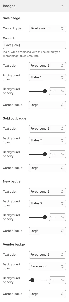
Use Online Store > Customize > Theme settings > Badges to customize the badges shown on product cards and product pages.
Sale badge
- Content type: Choose what the badge displays. Options: Text, Percentage, Fixed amount.
- Content: Appears when Content type is Percentage or Fixed amount.
[sale]will be replaced with the selected type (percentage, fixed amount). - Text color, Background color, Corner radius: Style the badge, as described below.
Sold out badge, New badge, and Vendor badge
Each badge exposes the same style controls:
- Text color and Background color: Pick a color from the active color scheme, Transparent, or Custom. A scheme background color shows a Background opacity slider (5-100%); Custom shows a Custom text color or Custom background color picker.
- Corner radius: Options: None, Extra small, Small, Medium, Large.
10. Product cards

Use Online Store > Customize > Theme settings > Product cards to change the look of the product cards used in collection grids and product sections.
- Style: Choose the card layout. Options: Standard, Inverted.
- Product media hover effect: Choose what happens to the card image on hover. Options: Auto, Carousel, Carousel autoplay, Video.
- Show compare: Show/hide the Compare button on the card.
The group also reminds you to set up Pre-order for out-of-stock products. See the Setup pre-order guide. To learn where product cards are used, see Product sections.
11. Collection cards

Use Online Store > Customize > Theme settings > Collection cards to change the look of collection cards.
- Style: Choose the card layout. Options: Standard, Hover reveal.
To learn where collection cards are used, see Collection sections.
12. Article cards

Use Online Store > Customize > Theme settings > Article cards to change the look of blog article cards.
- Style: Choose the card layout. Options: Standard, Boxed.
13. Cart
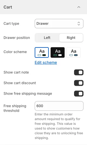
Use Online Store > Customize > Theme settings > Cart to set how customers interact with the cart.
- Cart type: Set what happens when the Add to cart button is selected. Options: Drawer (a slide-in cart), Page (go to the cart page), Popup notification (a small confirmation popup).
- Drawer position: Choose to show the cart drawer on the Left or Right of the screen.
- Color scheme: Choose the color scheme of the cart drawer or popup notification.
- Show cart note: Show/hide the order note field in the cart drawer.
- Show cart discount: Show/hide the discount code field in the cart drawer.
- Redirect to Cart page: Appears when Cart type is Page. Send the customer to the cart page after adding a product.
- Show free shipping message: Show the free shipping bar in the cart drawer.
- Free shipping threshold: Appears when the free shipping message is on. Enter the minimum order amount required to qualify for free shipping. This value is used to show customers how close they are to unlocking free shipping.
The drawer settings (position, note, discount, free shipping) appear only when Cart type is Drawer. To pair the free shipping bar with a real discount, see the Free shipping guide. To add gift wrapping, delivery notes, and other custom fields to the cart, see the Cart attributes guide.
14. Modal

Use Online Store > Customize > Theme settings > Modal to change the look of modals (for example, Quick view and popups).
- Inherit color scheme: Use the color scheme of the section that opened the modal.
- Color scheme: When inheriting is off, choose the color scheme applied to all modals.
- Modal padding and Modal padding mobile: Set the inner padding of the modal on desktop and mobile (0-100px).
- Animation type: Choose the opening animation. Options: None, Zoom, Fade, Fade up, Fade down, Fade left, Fade right, Smart zoom, Smart fade zoom, Slide up, Slide down, Slide left, Slide right.
- Easing: Choose the easing curve of the animation, from Linear and Ease through the quad, cubic, quart, and quint families to Bounce, Back, Elastic, Spring, Decay, and Bezier.
- Modal duration: Set how long the animation takes (200-2000ms).
- Modal backdrop opacity: Set the darkness of the overlay behind the modal (0-100%).
- Modal backdrop blur: Blur the page content behind the modal (0-100).
15. Drawer
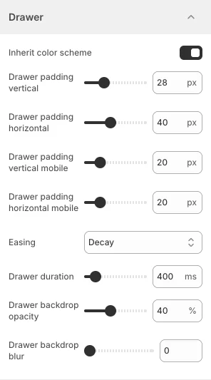
Use Online Store > Customize > Theme settings > Drawer to change the look of drawers (cart drawer, filter drawer, mobile menu, and more).
- Inherit color scheme: Use the color scheme of the section that opened the drawer.
- Color scheme: When inheriting is off, choose the color scheme applied to all drawers.
- Drawer padding vertical and Drawer padding horizontal: Set the inner padding of the drawer on desktop (0-100px).
- Drawer padding vertical mobile and Drawer padding horizontal mobile: Set the inner padding of the drawer on mobile (0-100px).
- Easing: Choose the easing curve of the slide-in animation. The options are the same as for modals.
- Drawer duration: Set how long the animation takes (200-2000ms).
- Drawer backdrop opacity: Set the darkness of the overlay behind the drawer (0-100%).
- Drawer backdrop blur: Blur the page content behind the drawer (0-100).
16. Swatches

Use Online Store > Customize > Theme settings > Swatches to customize how color swatches are displayed on product cards and product pages.
- Variant images: Use the variant's image as the swatch instead of a solid color.
- Width and Height: Set the swatch size (0-100px).
- Corner radius: Choose the swatch radius. Options: None, Extra small, Small, Medium, Large.
For a step-by-step setup, see the Color swatches guide.
17. Variant pickers

Use Online Store > Customize > Theme settings > Variant pickers to customize the appearance of variant option buttons on product pages.
- Variant width: Choose whether option buttons size to their content or stretch to fill the row. Options: Fit, Fill.
- Corner radius: Choose the option button radius. Options: None, Extra small, Small, Medium, Large.
To show color options as swatches instead of buttons, see the Color swatches guide.
18. Image lazyload

Use Online Store > Customize > Theme settings > Image lazyload to defer loading of off-screen images.
- Enable lazyload: Load images only when they are about to enter the viewport.
- Loading style: Choose the placeholder shown while an image loads. Options: Spinner, Circle, Dot.
19. Currency format

Use Online Store > Customize > Theme settings > Currency format to show the currency code next to prices.
Currency codes
- Show currency codes: Show the currency code next to prices across the store. Cart and checkout prices always show currency codes. Example: $1.00 USD.
20. Dark mode

Use Online Store > Customize > Theme settings > Dark mode to map each light color scheme to the dark color scheme that replaces it when dark mode is on.
- Dark mode mapping: Enter one pair per line in the format
Light scheme: Dark scheme, using the color scheme names from Theme settings > Colors. The default mapping is:
Scheme 1: Scheme 2
Scheme 3: Scheme 2
Every section, block, modal, or drawer that uses a scheme on the left switches to the scheme on the right when a visitor turns on dark mode. Schemes not listed keep their colors in both modes.
The visitor-facing toggle is the Show dark mode setting of the Floating sidebar section (see Header and footer). For the full setup, see the Dark and light mode guide.
21. Social media
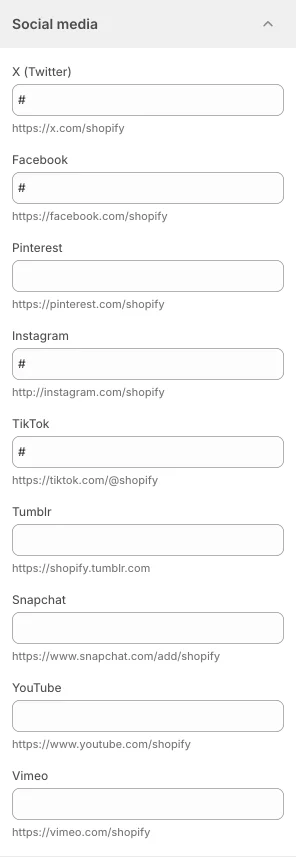
Use Online Store > Customize > Theme settings > Social media to integrate social media into your store.
- Social media accounts: Add the link to your store's social media. Enter links for X (Twitter), Facebook, Pinterest, Instagram, TikTok, Tumblr, Snapchat, YouTube, and Vimeo (for example,
https://x.com/shopify).
When you enter a social media link, the theme shows the corresponding icon in the Floating sidebar when its Show socials setting is on, and adds the profile to the store's structured data for search engines. Networks without a link are hidden.
22. Search

Use Online Store > Customize > Theme settings > Search to control how the search panel opens and what it searches.
- Inherit color scheme: Use the color scheme of the section that opened search.
- Color scheme: When inheriting is off, choose the color scheme of the search panel.
- Search type: Choose how search opens. Options: Drawer, Overlay.
- Search target: Choose which resources appear in search results. Options: All, Products only, Products and articles, Product and collections, Products and pages.
The search panel itself is the Predictive search section in the header group. See Header and footer.