Header & Footer Sections
These sections make up the global navigation, branding, and utility areas of your store. Most of them live in section groups rather than on individual pages, so they appear on every page once you configure them. Mind ships 1 header, 4 mega menus, and 1 footer, plus an announcement bar, a predictive search panel, a breadcrumb, a floating sidebar, and a mobile tab navigator.
Header
The navigation bar at the top of your store, with the logo, main menu, and action icons. It lives in the Header section group and can be added only once.

Features:
- Sticky behavior: Always, On scroll up, or None
- Color scheme with a background color (or a custom color)
- Logo position (Left or Center) with separate desktop and mobile logo width, and an optional fixed logo height for desktop and mobile
- Menu picker, menu type (Default or Drawer), mobile menu type (Slide up or Drawer), and menu event (Hover or Click)
- Container width (Global, Boxed, or Full) with a custom width and an optional separator line
- Use absolute on pages: float the header over the content on All pages, or on Home, Product, Collection, List collections, Blog, Others, or the pages you list (one rule per line), with its own color scheme, background opacity, background blur, and inverse logo
- Show or hide the currency selector and language selector
- Header actions: phone number, search, comparison, account, and cart
- Blocks: Bubble (a small label bound to a main menu item by its position, 1 to 10, with background and text colors, an Above or Aside position, and an optional custom SVG icon)
Announcement bar
A thin strip above the header for promotions, shipping notices, or countdowns. It has no preset: you add it to the Header section group, and it can't be used anywhere else.
section-announcement-bar.webp
Features:
- Announcement style: Text inline, Carousel, or Marquee
- Background color
- Carousel width, height, style (Horizontal or Vertical), autoplay, and speed in milliseconds
- Marquee speed, right-to-left direction, and stop on hover
- Blocks: Announcement (text with an optional link), Button (one per bar, Primary, Secondary, or Tertiary style), Count down (one per bar, counts to a date such as
2024-12-30 00:00), Image (with an image size)
Mega menu
Mind includes 4 mega menu sections. Each one attaches to a single top-level item of the header menu through its Menu assignment location setting (Item 1 to Item 10) and opens as a panel below the header. You can add several mega menus to the Header section group and bind each to a different menu item. Every mega menu has a Width setting (Fill or Boxed) and the universal color scheme, background, and padding controls (see Section Settings).
Mega menu about
A brand-focused menu with an introduction, link cards, contact details, and an optional featured article.
section-megamenu-about.webp
Features:
- Introduction with heading, text, and a button (label, link, preset, style, and size)
- Featured article: show or hide it and pick the article
- Contact column with its own heading and text
- Blocks: Link card (an icon image or a built-in icon, heading, description, and link), Contact (an icon image or a built-in icon, heading, text, and link)
- Up to 10 blocks
Mega menu collections
A row of collection cards for browsing your catalog straight from the menu.
section-megamenu-collections.webp
Features:
- Collection list picker
- Columns: 2 to 5
- Collection card: show the description, a button label, aspect ratio (Auto, 3:4, 1:1, 4:3, 16:9, or Custom with width and height ratios), and corner radius
Mega menu features
A grid of feature items grouped into columns, with an optional side panel of articles, products, or collections.
section-megamenu-features.webp
Features:
- Side panel: show or hide it, choose its content (Articles, Products, or Collections), add a heading, and pick the items
- Blocks: Column heading (starts a new column; the items that follow belong to it until the next column heading), Item (an icon image or a built-in icon, heading, badge, description, and link)
- Up to 16 blocks
Mega menu links
A column-based menu for product categories, with promo cards on the side.
section-megamenu-links.webp
Features:
- Columns setting for the link layout
- Blocks: Column (a column title and a menu), Promo (image with aspect ratio and corner radius, heading, badge text with background and text colors, and a button with label, link, preset, style, and size)
- Up to 8 blocks
Predictive search
The search panel that opens from the header search icon and shows live results as the visitor types. It has no preset and belongs to the Header section group.
section-main-predictive-search.webp
Features:
- Search type: Drawer (slides in from the side) or Overlay (covers the page)
- Color scheme for the panel
- Blocks: Link (a heading and a menu of suggested links), Product (one per panel, a heading and a hand-picked product list)
Breadcrumb
A trail of links that shows visitors where they are in your store. Mind adds it above the main content on the cart and product templates. You can add it to any template except the home page.

Features:
- Alignment
- Color scheme with a background color
- Top and bottom padding for desktop and mobile
Mind also has a Breadcrumb theme block that you can place inside other sections. See Basic Blocks.
Floating sidebar
A small fixed cluster of utility buttons anchored to a corner or edge of the screen. It lives in the Features section group.
section-floating-sidebar.webp
Features:
- Placement: Top left, Top right, Middle left, Middle right, Bottom left, or Bottom right
- Hidden on scroll down
- Show or hide the comparison, dark mode (see Dark/Light mode), social media, and back to top buttons
- Color scheme with background color and opacity, gradient, corner radius, border, and shadow
The social buttons use the links you add in Online Store > Customize > Theme settings > Social media.
Mobile tab navigator
A fixed bar of shortcuts at the bottom of the screen on mobile, like a native app's tab bar. It is hidden on desktop and lives in the Features section group.
section-mobile-dock.webp
Features:
- Width: Global or Fill
- Space below the bar
- Show labels under the icons
- Color scheme with background color and corner radius
- Padding on all four sides for desktop and mobile
- Blocks: Home, Menu, Account, Search, Cart (one of each)
Footer
The footer at the bottom of every page, with a newsletter signup, your logo, link columns, and a base row for localization, policies, and payment methods. It lives in the Footer section group and can be added only once.
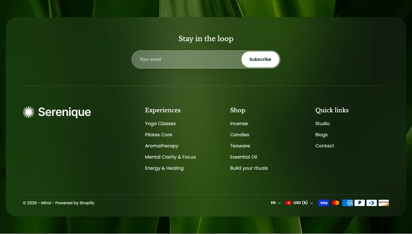
Features:
- Newsletter signup with a heading
- Logo and a separate dark mode logo, with desktop and mobile width (the store name is shown when no logo is set)
- Show or hide the currency selector and language selector
- Follow on Shop (requires Shop Pay), policy links, and payment methods
- Color scheme with a color, gradient, or image background, parallax, and an overlay
- Blocks: Link list (a heading and a menu)
Section groups
Mind organizes global sections into five groups. Open Online Store > Themes > Customize and use the left sidebar to add, remove, or reorder sections within each group.
- Header: Predictive search, Header, Mega menu links, and Mega menu collections by default. You can also add the Announcement bar, Mega menu about, and Mega menu features.
- Footer: Footer.
- Features: Floating sidebar and Mobile tab navigator.
- Overlay: Cart mini, Quick view, and Product compare modal. See Product Sections.
- Popup: Empty by default. You can add Popup age verification, Popup countdown promo, Popup promo, and Popup sign up. See Popup Sections.