Service Sections
Service sections present what you offer and how you deliver it, from a grid of service cards to step-by-step process layouts. Mind includes 7 service sections. Each one shares the universal section settings for color scheme, background, and padding.
Mind also ships templates built for selling services:
- Collection templates:
collection.service-1.json,collection.service-2.json, andcollection.service-3.jsonlist your services as a collection. See Change collection template. - Product templates:
product.service-detail-1.jsonandproduct.service-detail-2.jsonturn a product into a service detail page.product.service-detail-2.jsonuses the Service detail section below. See Change product template.
For the full list of sections in each template, see Page templates.
Service grid
A grid or carousel of service cards, each with an image, a description, tags, and an optional detail panel. It is available on page templates only.
section-service-grid.webp
Features:
- Heading with size, description, alignment, and header max width
- Grid or Carousel layout, with an option to switch to a carousel on mobile
- Columns for desktop and mobile, with global or custom gap
- Carousel speed, autoplay with custom interval, loop, and overflow hidden (All, Desktop, or Mobile)
- Card aspect ratio (Auto, 3:4, 1:1, 4:3, 16:9, or Custom)
- Show or hide the detail panel, tags, and description on every card
- Each card has an image, heading, description, and comma-separated tags
- Detail panel with up to three label and value pairs per card
- Blocks: Card
Service detail
A service overview for the product page, with an introduction, a teacher profile, and a weekly timetable. It is available on product templates only and is part of product.service-detail-2.json.
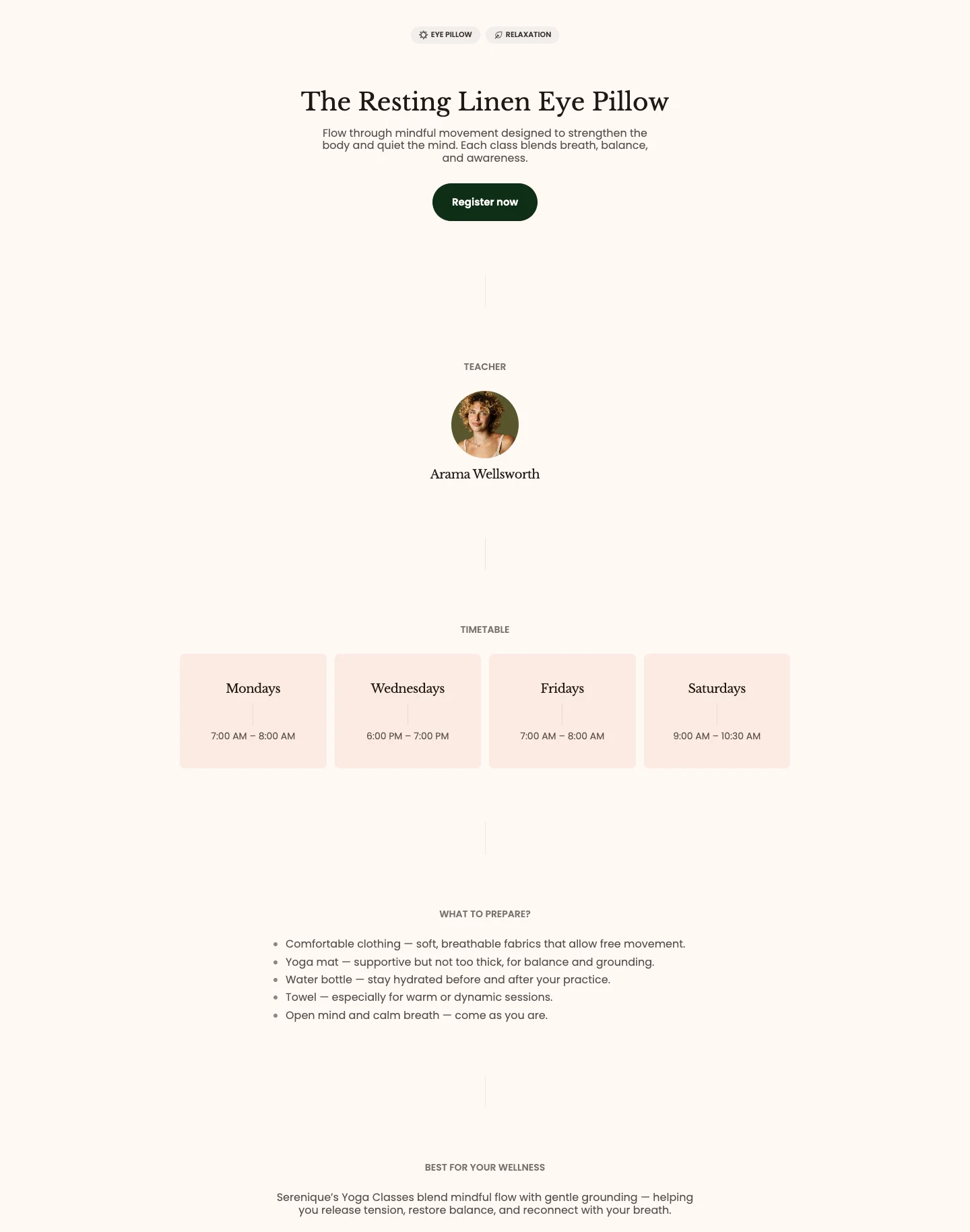
Features:
- Heading with animation (Global, Scroll, or Reveal) and description
- Button with label, link, preset, style, and size
- Teacher subheading, photo, and name
- Timetable subheading
- Text blocks with a subheading, description, and left or center text alignment
- Timetable day blocks with a day name and content
- Blocks: Text, Timetable day
Our process
A sequence of process steps joined by a gradient line.
section-our-process.webp
Features:
- Heading with size and animation (Global, Scroll, or Reveal)
- Line gradient that connects the steps
- Each item has a heading and description
- Blocks: Item
Step by step
A simple list of numbered steps under a heading.
section-step-by-step.webp
Features:
- Subheading and heading
- Each step has a heading and description
- Blocks: Step
Step by step showcase
Steps with an image for each one, so you can show the process visually.
section-step-by-step-showcase.webp
Features:
- Subheading and heading
- Each step has a heading, image, and description
- Blocks: Step
Step by step with tabs
A tabbed process where each tab reveals the content of one step.
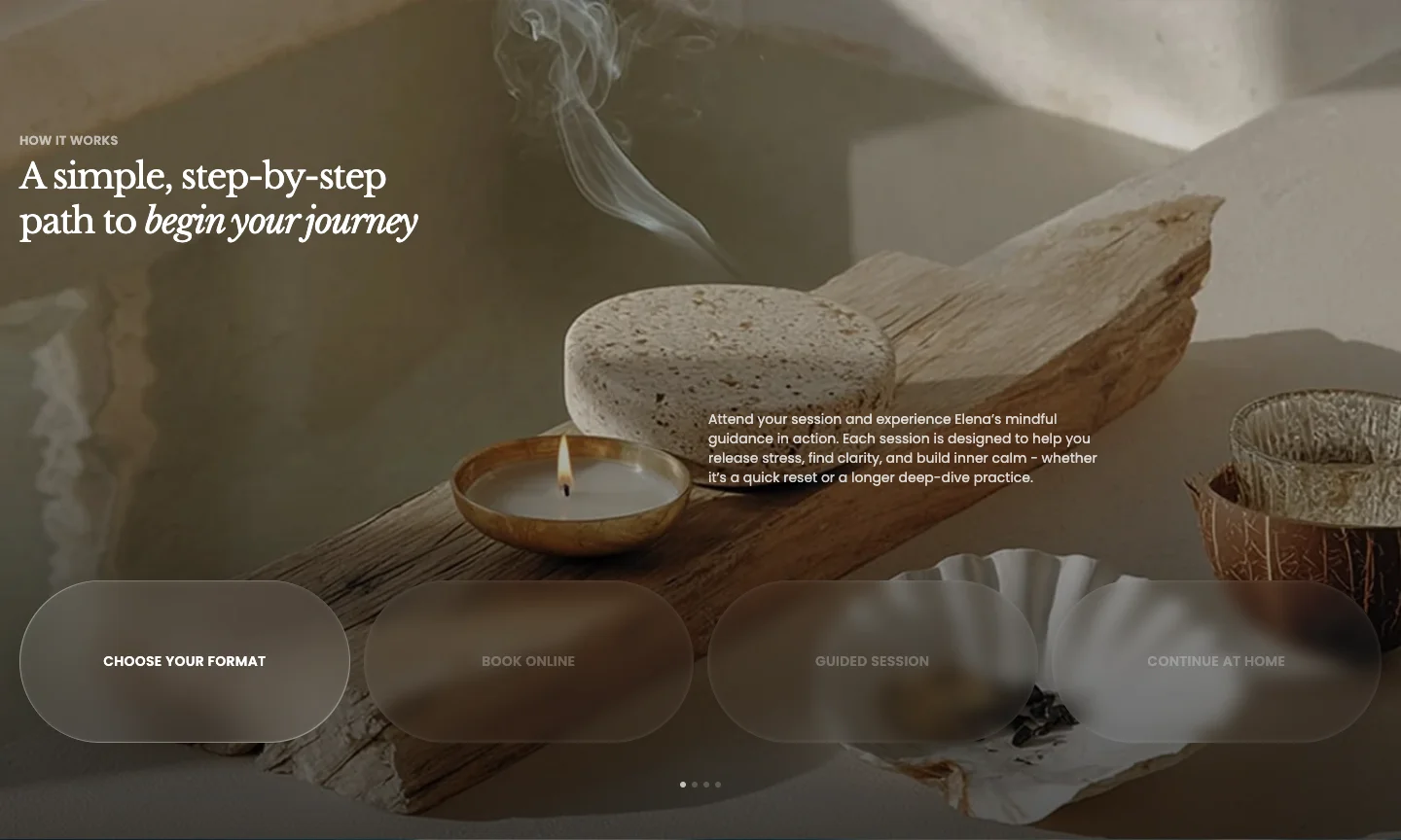
Features:
- Section height: Auto, Fill, or Custom with a custom height
- Up to 4 items, each with a tab title, subheading, heading, and text
- Blocks: Item
Step by step timeline
A timeline of steps where each step can carry up to three key figures.
section-step-by-step-timeline.webp
Features:
- Subheading and heading
- Section height: Auto, Fill, or Custom with a custom height
- Each step has a title and description
- Up to three stats per step, each with a value and label
- Blocks: Step
- Service catalog: Service grid on a page to list services with tags and key details.
- Service page: Service detail on a product page assigned the
product.service-detail-2template. - Explain your process: Our process or Step by step for a short text sequence, Step by step showcase when each step needs an image, Step by step with tabs for longer step content, and Step by step timeline when each step has numbers to show.