Media Sections
Media sections put imagery and video at the center of the page, from single banners and marquee galleries to collages, shoppable hotspots, and embedded video. Mind includes 12 media sections. Most of them appear under Image & Media in the section picker, and each one except Image scroll horizontal shares the universal section settings for color scheme, background, and padding.
Image banner
A single full-width image, often used at the top of collection and list-collections pages.

Features:
- Image with an overlay color
- Aspect ratio for desktop and mobile (Auto, 3:4, 1:1, 4:3, 16:9, or Custom), with an option for mobile to inherit the desktop value
- Corner radius from None to Extra extra large
Image gallery
A scrolling marquee of images that can pull its pictures from the product on product pages.
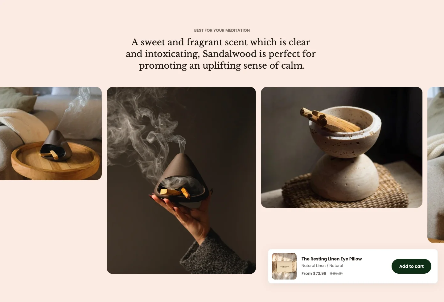
Features:
- Subheading, heading with size and animation, description, header layout (Centered or Split), and header max width
- Image source: Manual, Product media, or Product metafield (the
namespace.keyof a product image-list metafield) - Image width for desktop and mobile, and aspect ratio (Auto, 3:4, 1:1, 4:3, 16:9, or Custom)
- Marquee direction (Forward or Backward), alignment (Top, Middle, Bottom, or Zigzag), and zigzag offset
- Pause on hover, speed, and image spacing for desktop and mobile
- Each image block has its own image, desktop and mobile width, and aspect ratio
- Blocks: Image
Product media and Product metafield only apply on product pages. Elsewhere the section shows the manual image blocks. When image blocks exist, their width and aspect ratio are reused in order for the product images. See Product metafield data.
Image slider
A slider of images next to a content area with heading, text, and a button.
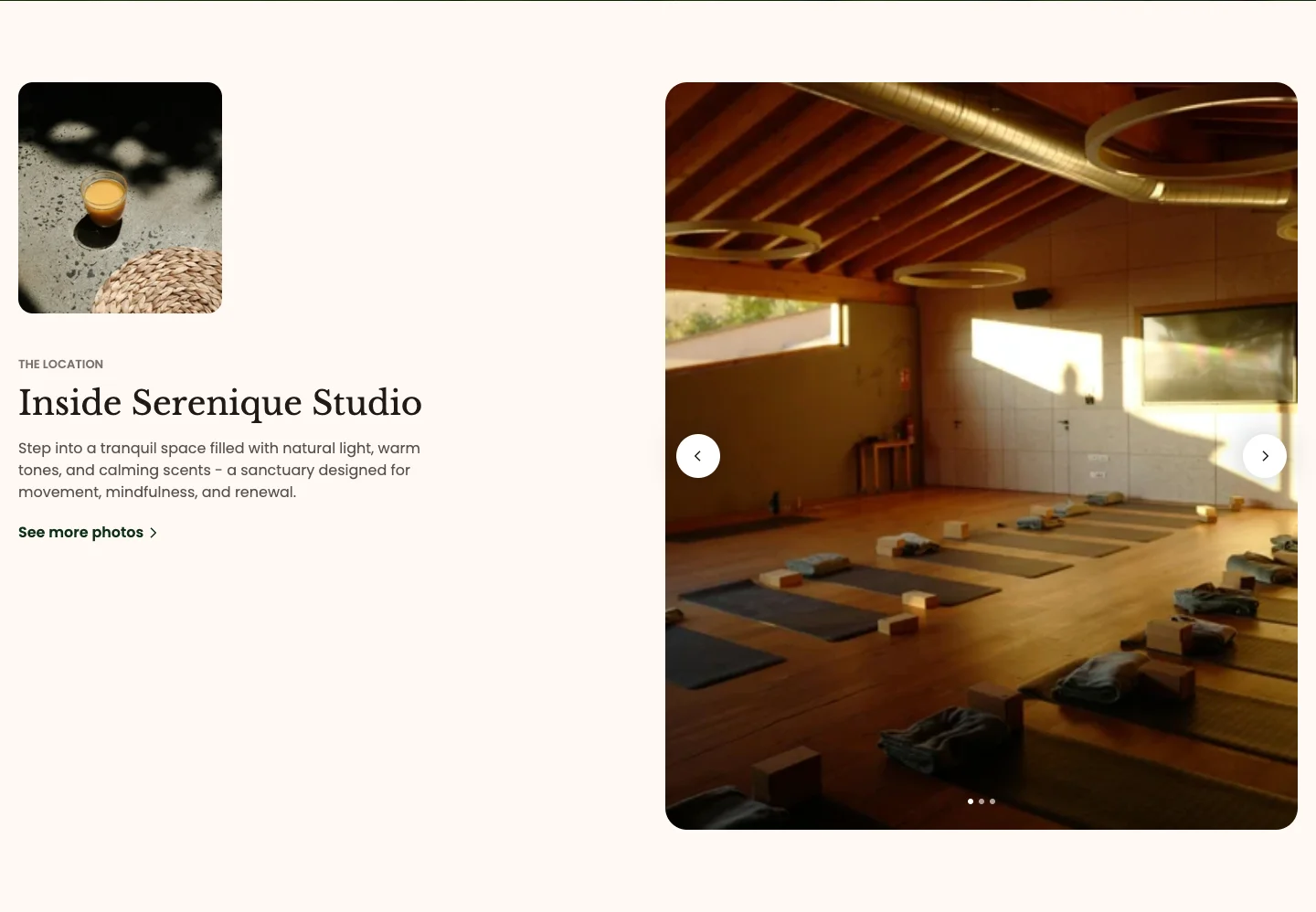
Features:
- Subheading, heading with size and animation, and text
- Content image
- Button with label, link, preset, style, and size
- Each slide has an image
- Blocks: Slide
Image slider highlight
A slider of image slides, each with its own heading and description.

Features:
- Heading with size and animation (Global, Scroll, or Reveal)
- Desktop and mobile image per slide, with an option for mobile to inherit the desktop image
- Heading and description per slide
- Image corner radius per slide
- Blocks: Slide
Image scroll horizontal
A scroll-driven sequence of panels, each with an image, text, and an optional background image.
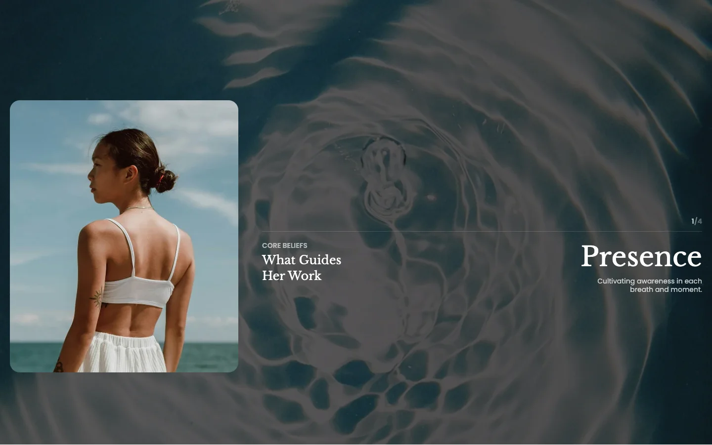
Features:
- Layout style: Centered image or Image left
- Direction effect: Horizontal or Vertical
- Each item has its own color scheme, subheading, heading, label, and description
- Item image with corner radius
- Item background image with a background overlay color
- Blocks: Item
Image with marquee
An image with a scrolling text and icon marquee in front of or behind it.

Features:
- Marquee placement (Front or Behind) and position (Top, Center, or Bottom)
- Contrast blend for marquee text over the image
- Direction (Forward or Backward), text color, alignment, pause on hover, and speed
- Sync the marquee with page scroll
- Item spacing for desktop and mobile
- Image with corner radius
- Text blocks with rich text
- Icon blocks with a theme icon or image (plus a dark mode image), icon size, color, and opacity
- Blocks: Text, Icon
Collage carousel
A carousel of images with an optional tag on each one.

Features:
- Subheading, heading with size and animation, and header max width
- Columns for desktop and mobile, with global or custom gap
- Card aspect ratio (Auto, 3:4, 1:1, 4:3, 16:9, or Custom) and corner radius
- Each image has a tag
- Blocks: Image
Collage grid
A grid collage where each card can span several columns and rows.

Features:
- Subheading, heading with size and animation, and header max width
- Columns for desktop and mobile, with global or custom gap
- Height per row for desktop and mobile, and card corner radius
- Each card can be full width or span a set number of columns and rows
- Each card has an image, tag label, heading, description, and link
- Blocks: Card
Collage masonry
A masonry layout of image cards with text and links.
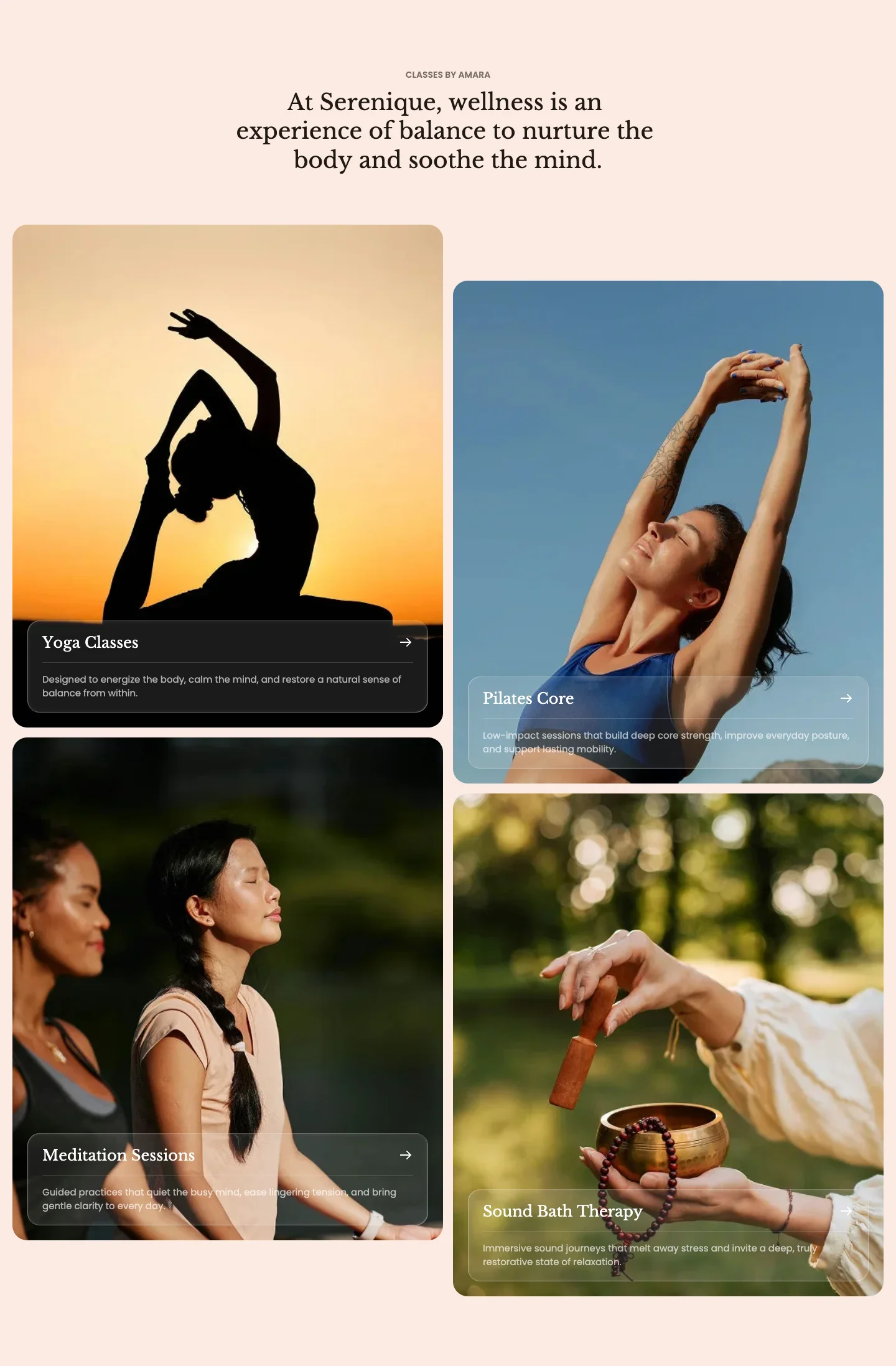
Features:
- Subheading, heading with size and animation, and header max width
- Card aspect ratio (Auto, 3:4, 1:1, 4:3, 16:9, or Custom)
- Corner radius for the card and for its content
- Each card has an image, heading, description, and link
- Blocks: Card
Gallery showcase
A three-image collage with a list of feature labels, designed for product pages.
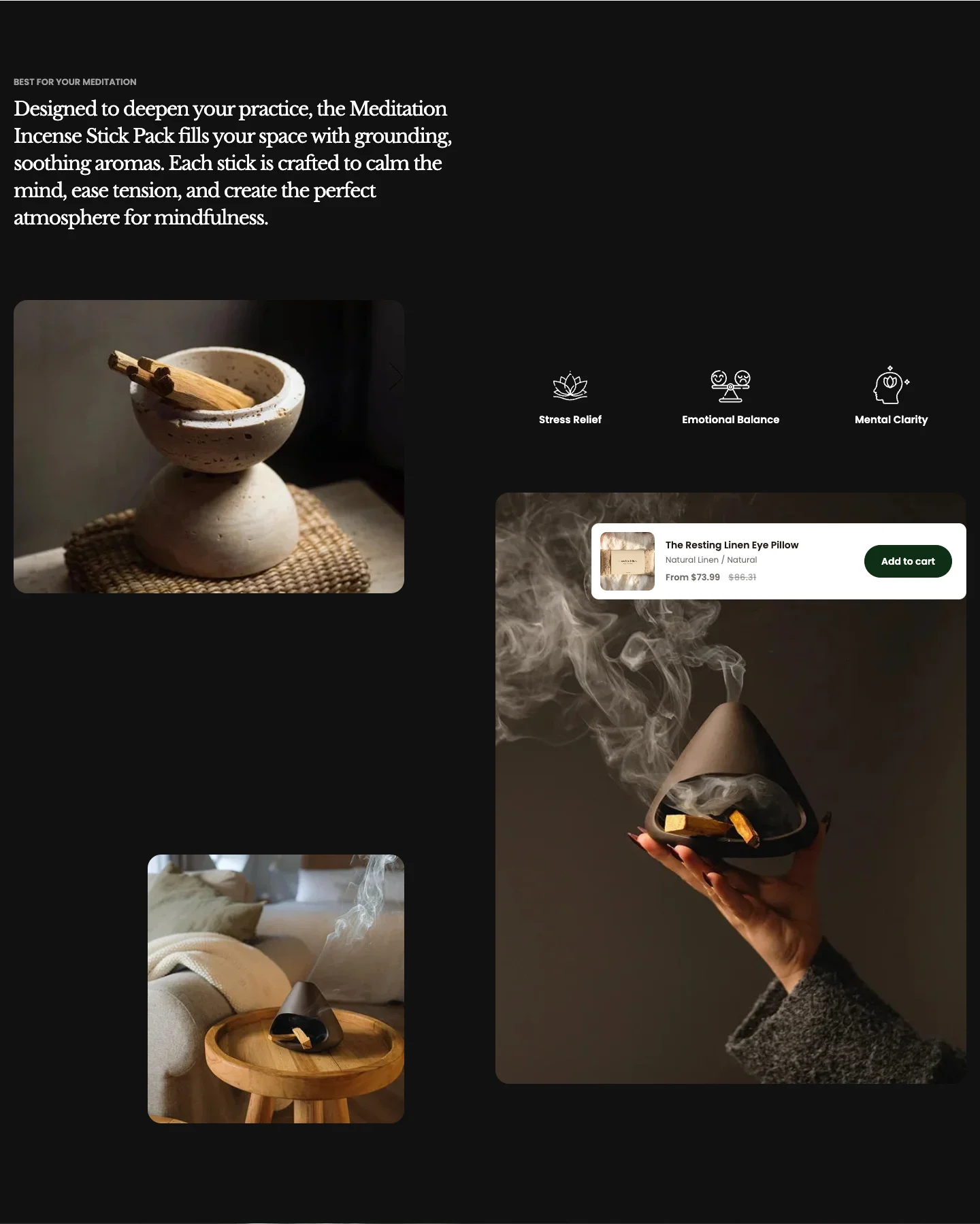
Features:
- Subheading and heading with size
- Image source: Manual, Product media, or Product metafield
- Image blocks with their own aspect ratio
- Feature blocks with an icon image and label
- Up to 10 blocks
- Blocks: Image, Feature
Manual uses the first 3 image blocks. Product media and Product metafield only apply on product pages; they fill the 3 collage slots with the first product images, and the aspect ratios still come from the image blocks.
Shop the look
A shoppable image with hotspots that open product cards. It appears under Hotspots in the section picker.

Features:
- Subheading, heading with size and animation, and description
- Reviewer rating, name, and role
- Separate desktop and mobile images, each with width (Fill or Custom) and aspect ratio, plus corner radius
- Product card color scheme, aspect ratio, and show price
- Up to 6 hotspots, each linked to a product
- Product card width for desktop and mobile, and placement (12 positions around the dot)
- Hotspot dot opened on Hover or Click, with size, color, and opacity
- Top and left position of each dot for desktop and mobile
- Blocks: Hotspot
Video
An uploaded or external video with a cover image and a play button.

Features:
- Type: Uploaded or External URL
- Cover image and video alt text
- Loop video, autoplay, and controls
- Aspect ratio (Auto, 3:4, 1:1, 4:3, 16:9, or Custom) and corner radius
- Play button color scheme, icon size, width, and height
- One strong image: Image banner for a page header, Image with marquee when you want moving text over it.
- Many images: Image gallery for a scrolling strip, Collage grid or Collage masonry for an editorial layout, Collage carousel for a swipeable set.
- Product pages: Image gallery and Gallery showcase can read product media or a metafield, so one template works for every product.
- Shoppable content: Shop the look to link products directly from a lifestyle photo.