Promotion Sections
Promotion sections turn browsing into buying: product bundles that add to the cart in one click, time-limited offers with a live countdown, subscription pricing, and a closing call to action. Mind includes 5 promotion sections. Each also has the universal color scheme, background, and padding controls described in Section Settings.
Bundle promotions
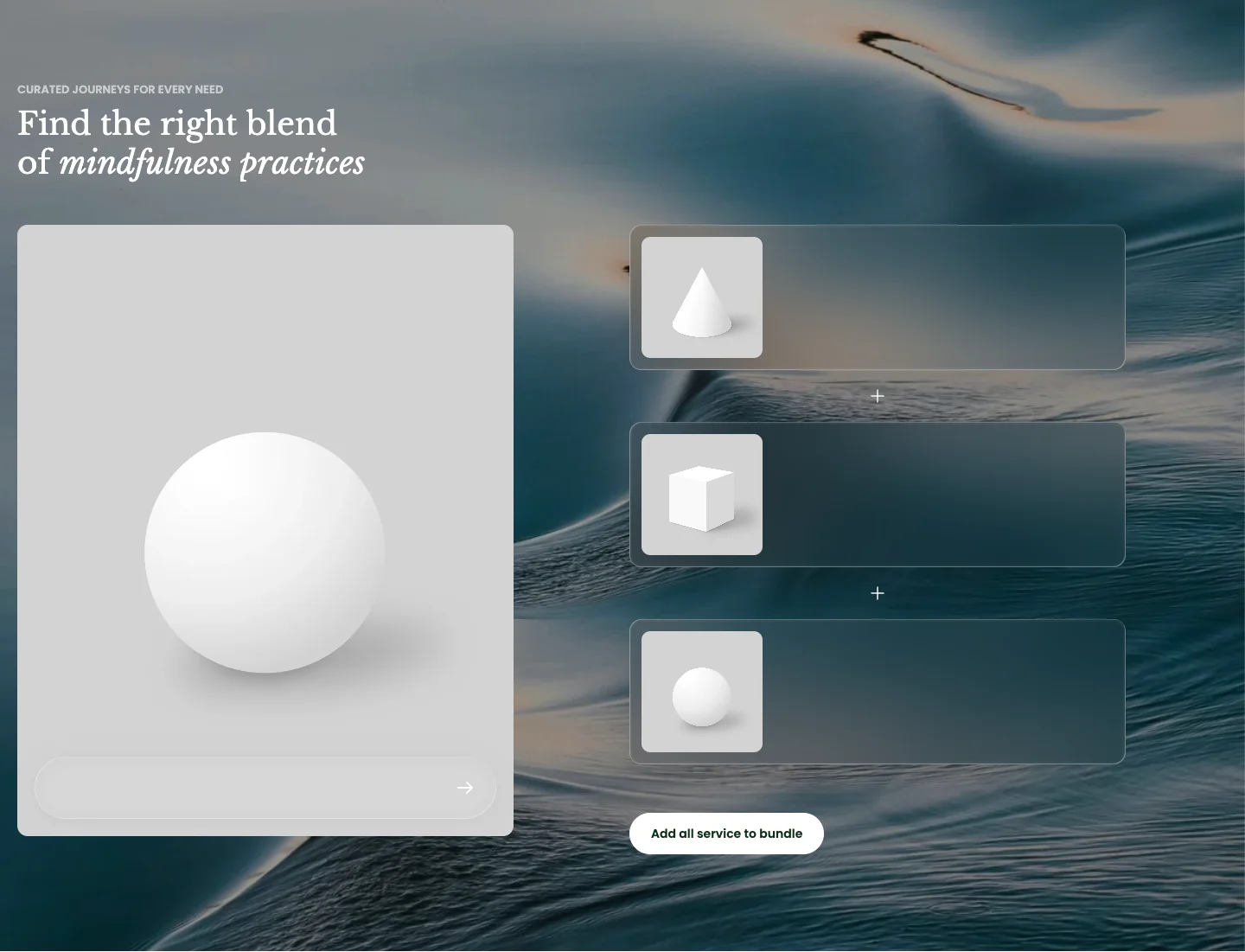
A collection card on one side and a stack of bundle products on the other, joined by plus signs, with a single button that adds the whole bundle to the cart. Customers can pick variants for each product before adding.
Features:
- Products list that makes up the bundle
- Header with Sub heading, Heading, Heading size, and Heading animation
- Collection card: Collection, Color scheme, Aspect ratio (Auto, 3:4, 1:1, 4:3, 16:9, or Custom), and Corner radius; the card stays sticky while the product list scrolls
- Product card: Aspect ratio, Show price, Show description, and Show tag
- Button with label, Button preset, Button style, and Button size for the add-all button
- Products with several variants open an option picker, shown as a bottom sheet on mobile
Combo bundle
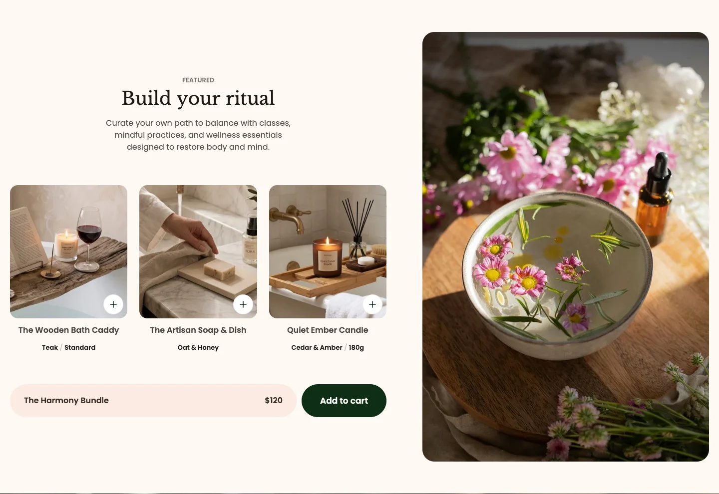
A curated set of products shown as bundle cards beside a lifestyle image, with a bundle title, a bundle price, and an Add to cart button that adds every product at once. It appears on the default home page and the default product template.
Features:
- Products list that makes up the combo
- Header with Sub heading, Heading, Heading size, Heading animation, and a rich text Description
- Bundle: Bundle title and Bundle price (both rich text), plus Bundle radius for the bundle bar
- Product card: Aspect ratio and Show price
- Image with a Link, shown beside the bundle
The Bundle price is text you type; it is not calculated from the products. Update it when product prices change, and set up the matching discount in Discounts in your Shopify admin.
Countdown banner
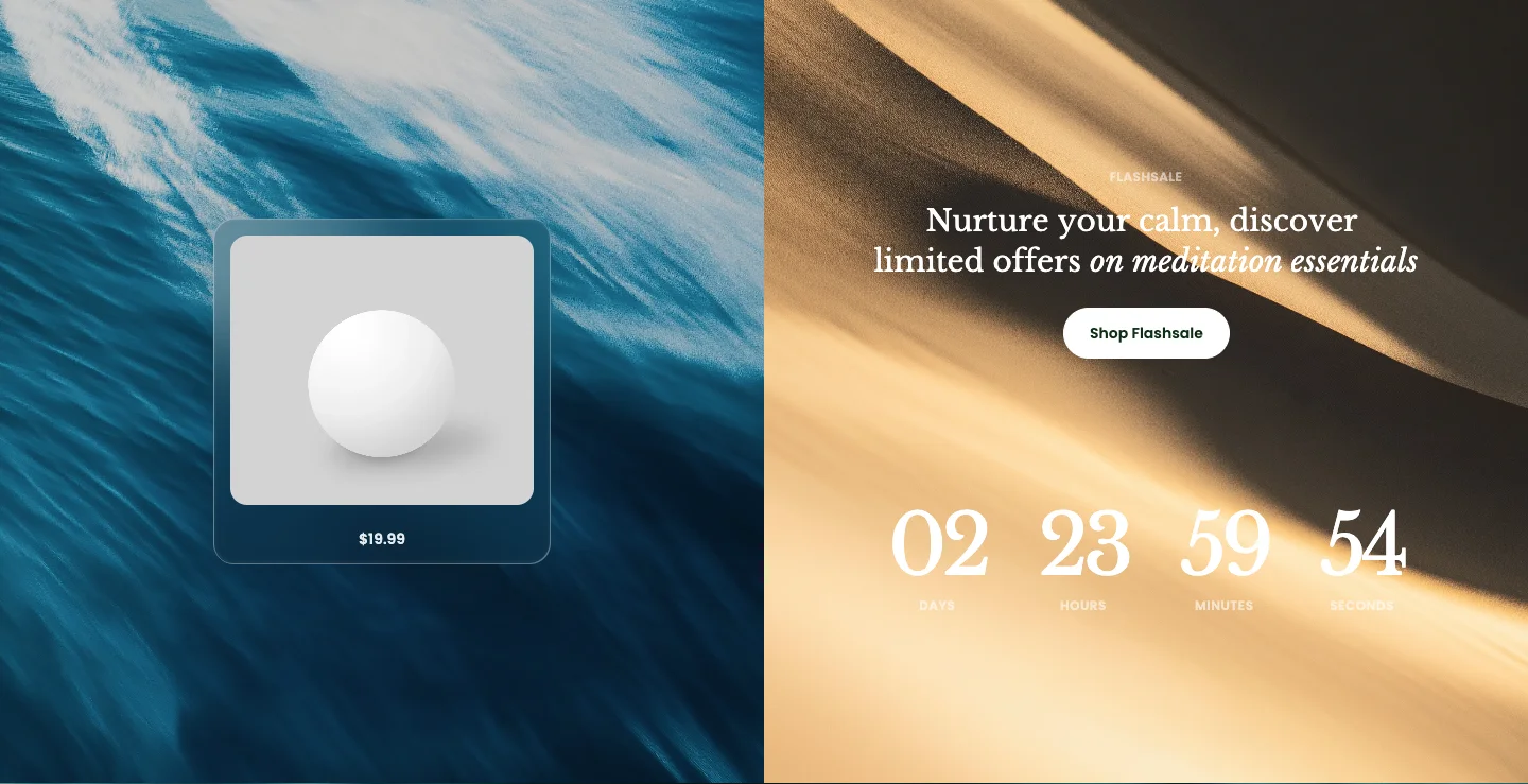
A promotional banner with a live countdown timer, an optional featured product card, and a button. Use it for flash sales and limited-time offers. It ships with three presets that share the same settings.
Features:
- Layout: Two panels or Single background, with Content position (Left or Right) and Content alignment (Left or Center)
- Text: Sub heading, Heading, Heading size, and Heading animation
- Button with label, link, Button preset, Button style, and Button size
- Product card: Show product card, Product, Aspect ratio, Show price, and Show tag
- Media: Product panel image, Content panel image, and Product panel overlay opacity for the two-panel layout
- Timer style: Plain or Card
- Timer mode: Fixed date, counting down to a Time you enter (for example 2025-10-30 00:00), or Evergreen, which counts down a rolling period set by Evergreen unit (Days, Hours, Minutes, or Seconds) and Evergreen value instead of a fixed date
- Countdown ended text shown when the timer reaches zero
- Section background can also be an image, with separate desktop and mobile images, parallax, and a color or gradient overlay
Countdown banner
The default preset: a two-panel layout with the content on the right and a product panel on the left, with a three-day evergreen timer.
Countdown banner: Flashsale
A single-background layout with a background image and overlay, left-aligned content, a plain timer, and the product card turned on.
Countdown banner: Centered
A single-background layout with centered content, an extra-large heading, card-style timer digits, and no product card.
Subscription plan
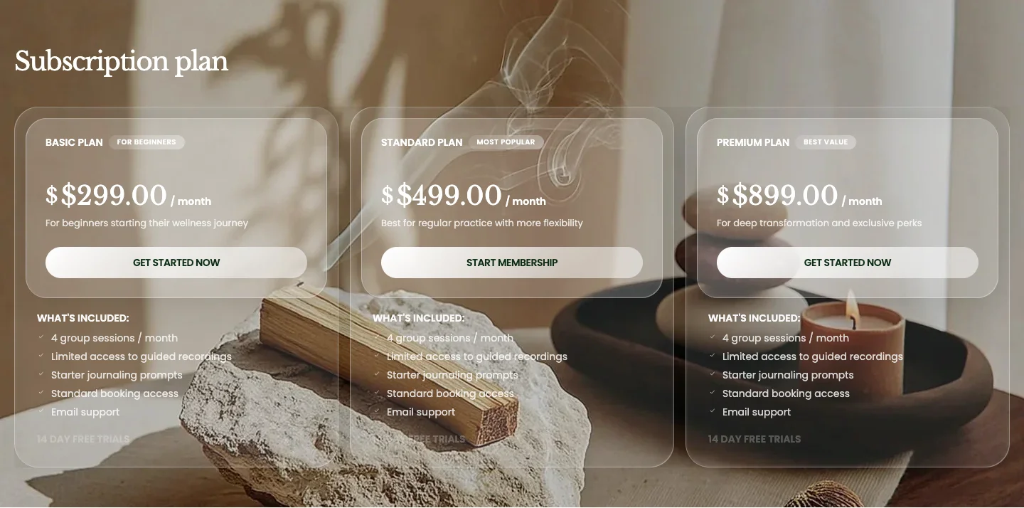
A row of pricing cards for membership, subscription, or service plans, each with a price, a feature list, and a button. You can highlight one plan as the recommended choice.
Features:
- Card style: Panel, Flat, or Column
- Header with a Heading and Heading size
- Layout: Grid or Carousel, with Carousel on mobile, columns for desktop and mobile, and a Global or Custom gap
- Blocks: Plan, each with a Plan name, Badge, Highlight this plan, Description, Price prefix, Currency symbol, Price, Billing period, Button label and Button link, Features heading, Features (one per line), and a Trial note
The plan prices are text you type, not Shopify prices. Point each plan's Button link at the product, subscription app page, or contact page that handles the sign-up.
Call to action
A full-width banner with a background image, a heading, and a button, used to close a page with one clear next step. It appears at the bottom of the home page, the collection, blog, and article templates, and several page templates.

Features:
- Content: Content color scheme and Card style (None or Glass, which places the text on a frosted panel)
- Header with Sub heading, a rich text Heading, Heading size, and Heading animation
- Image: Background image for desktop and a separate Background image mobile, Image overlay color, and Corner radius
- Button with label, link, Button preset, Button style, and Button size
- Use Bundle promotions to sell a collection's best pieces together, with a variant choice for each product.
- Use Combo bundle for a fixed kit with a single bundle price, on the home page or a product page.
- Use Countdown banner when the offer has a deadline.
- Use Subscription plan for recurring plans or service packages.
- Use Call to action as the last section of a page to point visitors to one next step.