Hero Sections
Hero sections are full-width, high-impact openers designed for the top of your pages. You find them under the Banners category when you add a section. Mind includes 14 hero sections: slideshows and carousels for the home page, editorial banners for About and landing pages, and a page title header for collections, blogs, and other pages.
Banner image
A full-width banner with a sub heading, a large heading, and a button over a color, gradient, image, or video background.
section-banner-image.webp
Features:
- Sub heading and heading, with heading size (Small to Extra extra large) and heading animation (Global, Scroll, or Reveal)
- Button with label, link, preset, style, and size
- Background type: Color, Gradient, Image, or Video, with desktop and mobile images, optional parallax, and an overlay (Color or Gradient)
- Corner radius and border
Banner slideshow
A full-width slideshow where each slide's title is listed under a heading, and clicking a title switches to its slide. It appears on the default home page and the alternate home pages.
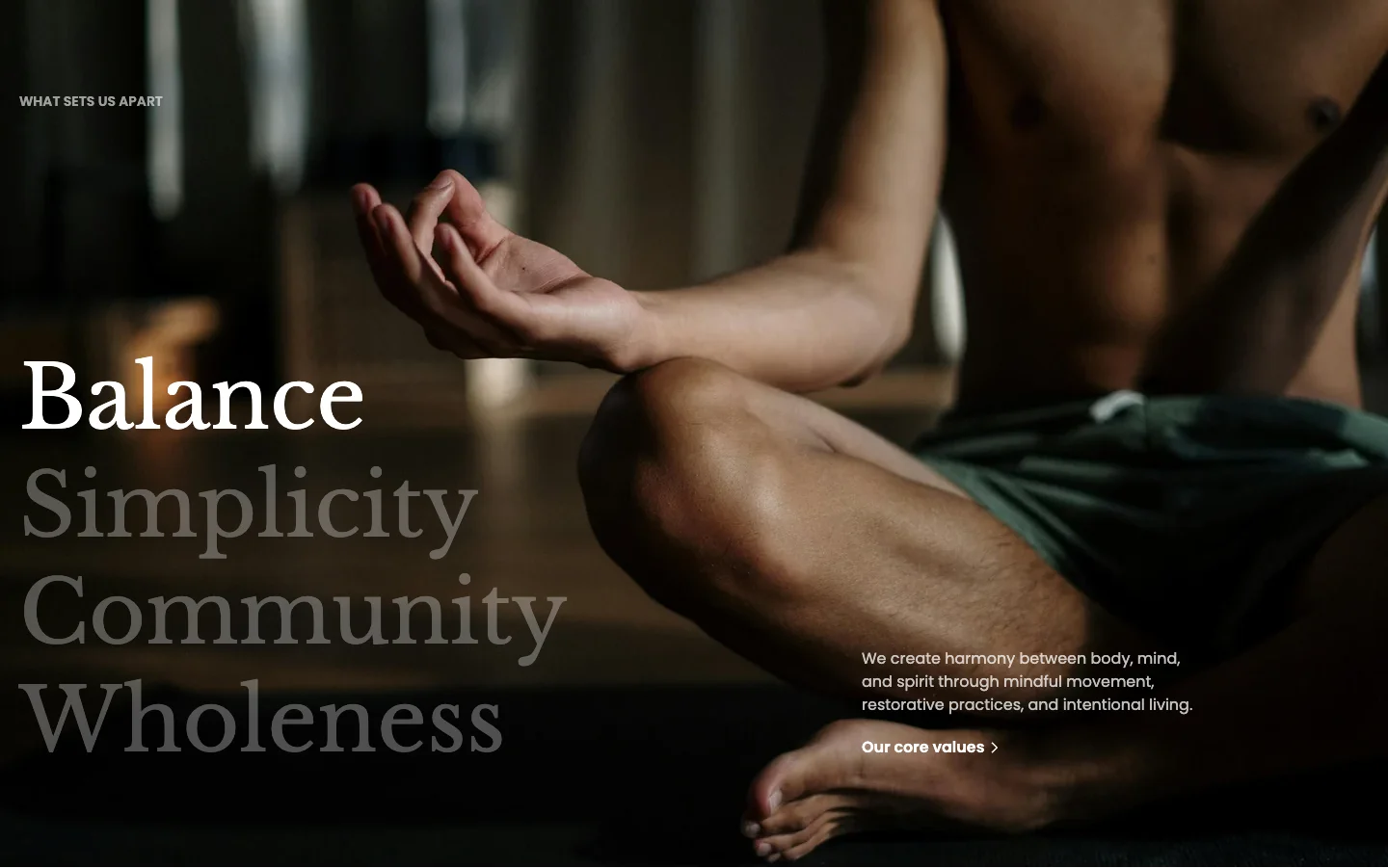
Features:
- Heading shown above the list of slide titles
- Transition effect (Fade, Urban, or Nature) and speed
- Separate height for desktop and mobile
- Blocks: Banner slide (up to 4; title, description, content alignment and position, content max width, a button with label, link, preset, style, and size, and an image or video background with desktop and mobile versions and an overlay)
Banner with card
A full-width image with a scrolling word marquee and a centered product card with a button. It is available on page and collection templates, and the service collection templates use it.
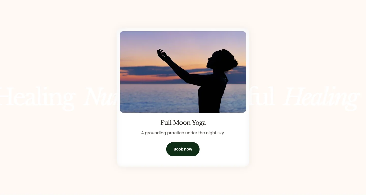
Features:
- Banner image with optional parallax
- Marquee position (Top, Center, or Bottom) and alignment, direction, speed, pause on hover, and sync with page scroll
- Marquee word spacing for desktop and mobile, text color and opacity, and a contrast blend that inverts the words against the image
- Card with its own color scheme, showing the product you pick
- Button with label, preset, style, and size; it links to the product
- Blocks: Word (each word in the marquee)
Hero banner cover
A full-screen cover with a single large heading over a background image. It is available on page templates only.
section-hero-banner-cover.webp
Features:
- Heading with an animation (Global, Scroll, or Reveal); wrap words in square brackets to dim them, for example
Shaping tomorrow's [business] - Background image for desktop and mobile
- Background overlay: None, Color, or Gradient
Hero banner editorial
A full-screen editorial opener with a heading and a short description over an image or video.
section-hero-banner-editorial.webp
Features:
- Heading and description
- Background type: Image or Video, with desktop and mobile images and optional parallax
- Background overlay: None, Color, or Gradient
Hero banner headline
A full-screen headline that scrolls as a marquee, mixing large words with inline images, followed by a short description.
section-hero-banner-headline.webp
Features:
- Description under the headline
- Marquee direction, pause on hover, speed, and word spacing for desktop and mobile
- Background image for desktop and mobile with optional parallax and an overlay
- Blocks: Word (text), Image (image with height and corner radius)
Hero banner highlight
A full-screen opener with a heading, a featured image, and two short lines of text placed on either side. It opens the About page template.
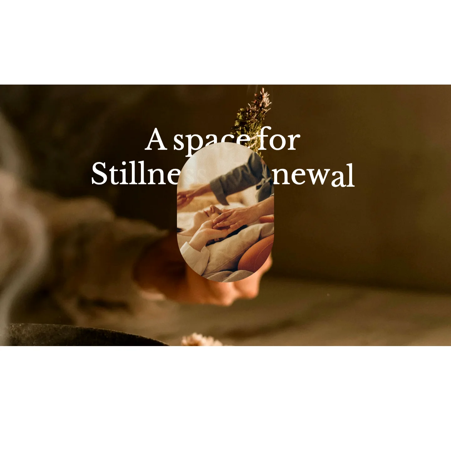
Features:
- Heading, text left, and text right
- Image with aspect ratio (Auto, 3:4, 1:1, 4:3, 16:9, or Custom with width and height ratios) and corner radius
- Background type: Image or Video, with desktop and mobile images, optional parallax, and an overlay
Hero banner insight
A founder or brand introduction with a heading, a shaped image, and a caption. It opens the About 2 and About 3 page templates.
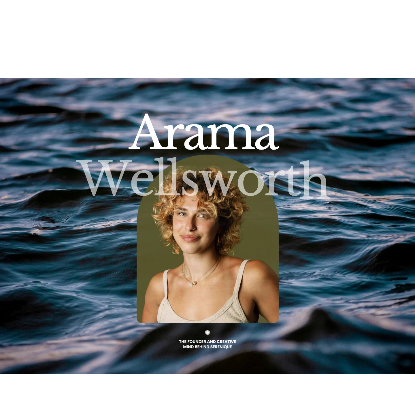
Features:
- Heading layout: Centered (one heading) or Split (left and right headings)
- Image with aspect ratio, corner radius, and a decorative shape (Arch, Arc Corner, Wavy Blob, Convex, Hourglass, Cloud, Butterfly, Petal Shield, Flower Quad, Layered Oval, or Stamp)
- Caption text with a caption icon
- Background type: Image, Video, or Gradient, with desktop and mobile images and an overlay
Hero banner showcase
A project-style opener with a large heading over a background image and a card holding an image and a short description. It is available on page templates only.
section-hero-banner-showcase.webp
Features:
- Color scheme
- Background image with an overlay (None, Color, or Gradient)
- Heading
- Card with an image and a description
Banner with testimonial
A home page opener that pairs a heading, text, and button with a rotating set of customer quotes. It opens the Home 2 page template.
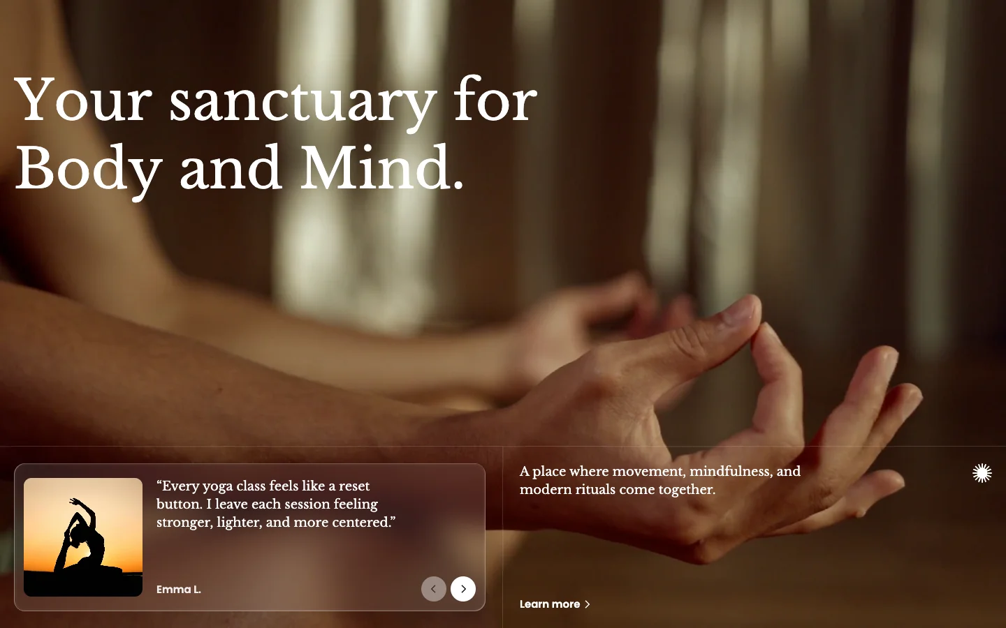
Features:
- Heading with an animation (Global, Scroll, or Reveal) and text
- Decorative icon: None, Sun, Star, Leaf, or Plus
- Button with label, link, preset, style, and size
- Background type: Color, Gradient, Image, or Video, with desktop and mobile images and an overlay
- Blocks: Testimonial (image, quote, and author)
Hero banner with video
A centered heading, description, and button above a large video. It opens the Home 3 page template and the List collections 2 page template.
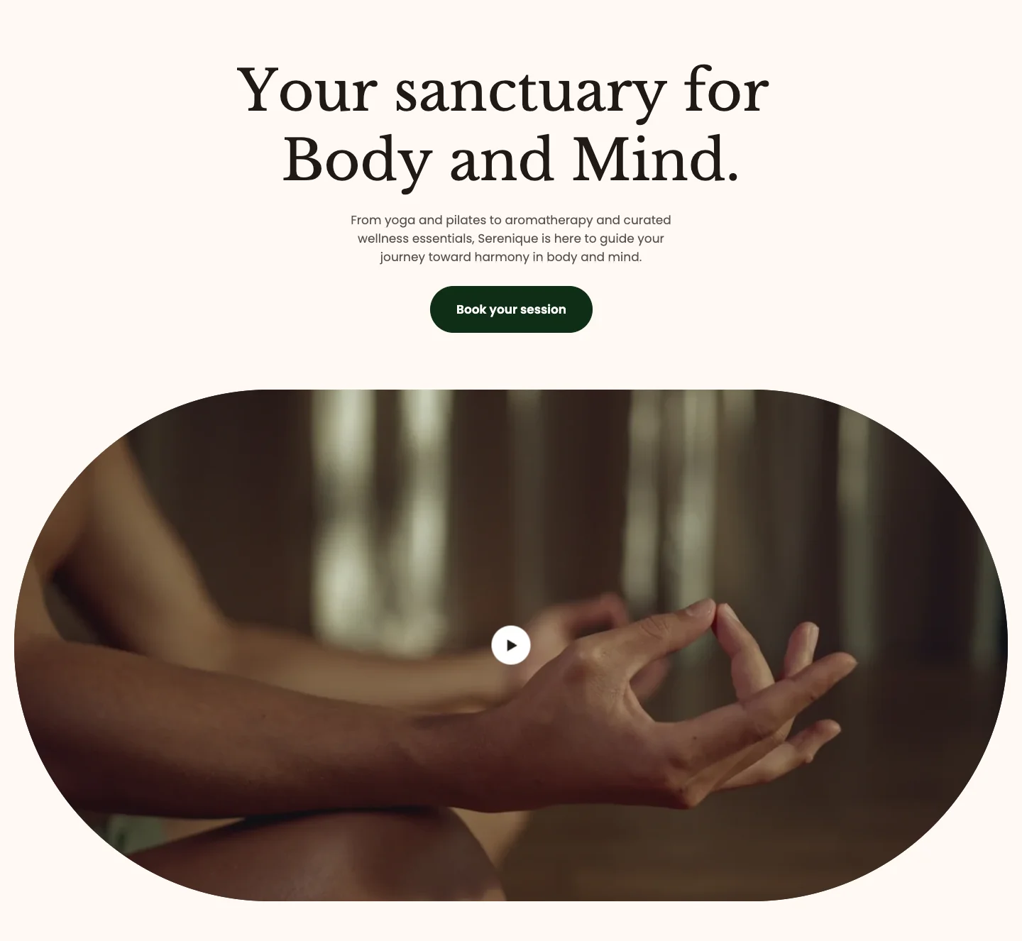
Features:
- Heading with an animation, header max width, and description
- Button with label, link, preset, style, and size
- Video type: Uploaded or External URL, with a cover image, loop, autoplay, and controls
- Video aspect ratio, alt text, and corner radius
- Play button with its own color scheme, icon size, width, and height
- Background type: Color or Gradient
Hero carousel
A full-screen carousel where each slide shows a large heading over an image or video, with an optional product card. It opens the default home page.
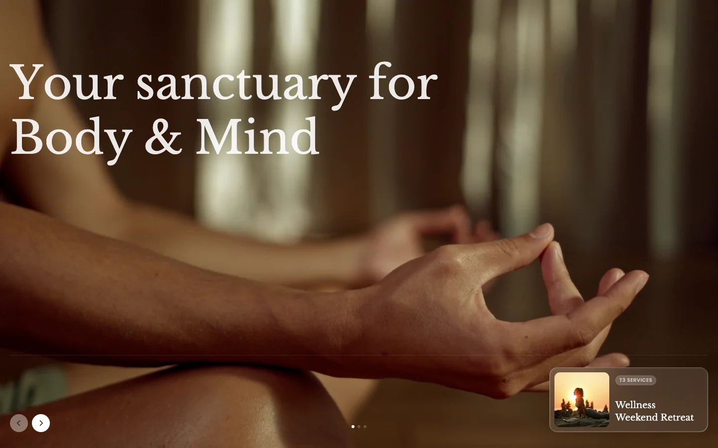
Features:
- Transition effect (Fade, Urban, or Nature) and speed
- Autoplay with a custom autoplay time, and loop
- Pagination to move between slides
- Color scheme
- Blocks: Hero slide (image or video background with desktop and mobile versions, heading with size, font style, and max width, and a product shown as a card)
Panorama slider
A heading, description, and button above a 3D marquee of scrolling images. It opens the Home 4 and Home 5 page templates.
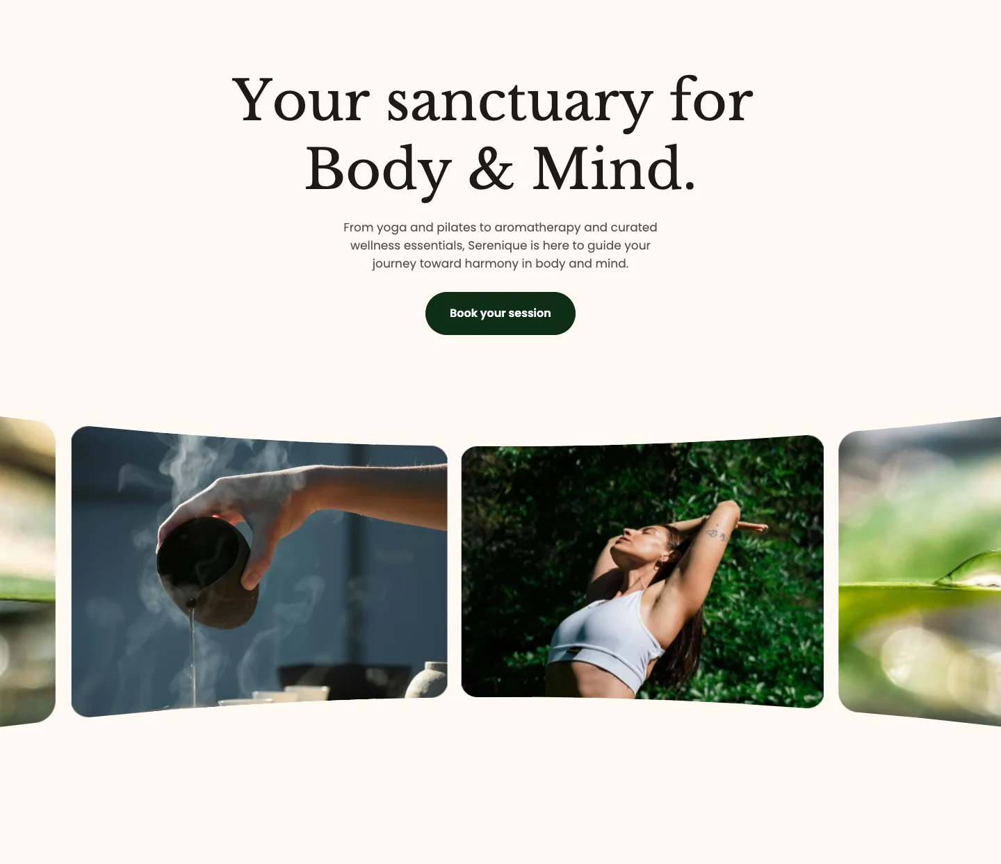
Features:
- Heading with size and animation, header max width, and description
- Button with label, link, preset, style, and size
- Background type: Color or Gradient
- Blocks: Image (up to 6; image with corner radius)
Page title
The header of an inner page: a heading, an optional breadcrumb, and a short description. Leave the heading empty to show the page, collection, or blog title. You can add it to any template except the home page, and the collection and blog templates use it.

Features:
- Heading with size and description
- Show breadcrumb, with the space below it
- Alignment and content width
- Height: Auto, Fill, or Custom
- Background type: Color, Gradient, or Image, with desktop and mobile images, optional parallax, and an overlay
Page title
The default preset: a centered, large heading on the page background color with auto height.
Page title: With background
A taller preset with a left-aligned, extra extra large heading, a narrower content width, a custom height, and a contrasting color scheme. Add a background image to turn it into a page banner.
- Use Hero carousel or Banner slideshow when you want to rotate several campaigns in one slot; Hero carousel can feature a product on each slide.
- Use Banner with testimonial, Hero banner with video, or Panorama slider for a home page opener with a clear call to action.
- Use Hero banner highlight, Hero banner insight, Hero banner cover, or Hero banner showcase to introduce an About, project, or landing page.
- Use Page title as the header of collection, blog, and other inner pages.