Page Templates
Mind ships 34 page templates (JSON) plus a gift card template. A template defines which sections a page starts with and in what order. You can edit any template in the theme editor, and you can create further variants of your own from the same starting points.
Homepage templates
Mind comes with five complete homepages. Index is the default homepage; the four Home templates are alternate homepages saved as page templates, which you can copy onto the index page or assign to any page. Each one is a full story built from hero, product, editorial, and media sections.
| Template | Sections included |
|---|---|
Index (default) — index.json | Hero carousel, Image with text, Product scroll horizontal, Image with text feature, Video, Stacked cards slider, Collections, Combo bundle, Banner slideshow, Testimonial with image, Call to action |
Home 2 — page.home-2.json | Banner with testimonial, Image parallax with text, Products scroll vertical, Multi column, Video, Stacked cards slider, Featured collection, Collections, Banner slideshow, Shop the look, Call to action, Scrolling text, Image with text service |
Home 3 — page.home-3.json | Hero banner with video, Image parallax with text, Product scroll horizontal, Multi column, Text with icons, Image with text insight, Stacked cards slider, Collection marquee, Image slider, Banner slideshow, Shop the look, Call to action, Scrolling text, Image with text service |
Home 4 — page.home-4.json | Panorama slider, Image with text about, Products scroll vertical, Image with text insight, Image slider, Image with marquee, Collection with banner, Collection showcase tabs, Banner slideshow, Testimonial with image, Call to action |
Home 5 — page.home-5.json | Panorama slider, Icon features, Collage masonry, Image with text insight, Stacked cards slider, Video, Collection with banner, Collection showcase tabs, Banner slideshow, Shop the look, Call to action, Image with text service |
To switch your store to one of the alternate homepages, follow Change the homepage preset.
Product templates
Mind includes four product page layouts: two for physical products and two for services. Three of them use the Main product section, which renders the product media and every product block. The fourth, Service detail 2, replaces it with the Service detail section for a service-style page.
| Template | Media layout | Sections included |
|---|---|---|
Product (default) — product.json | Grid | Breadcrumb, Main product, Image gallery, Video, Combo bundle, Related products |
Product 2 — product.product-2.json | Carousel vertical | Breadcrumb, Main product, Collapsible content, Gallery showcase, Video, Related products |
Service detail 1 — product.service-detail-1.json | Grid | Breadcrumb, Main product, Image gallery, Video, Related products |
Service detail 2 — product.service-detail-2.json | — | Image banner, Service detail, Image gallery, Section, Video, Testimonial with image, Related products |
The default Product template starts with Media, Product title, Price, Product description, Variant picker, Buy buttons, Divider, Videos, and four Collapse rows. Product 2 and Service detail 1 keep a shorter stack of Media, Product title, Price, Product description, and Buy buttons. All three turn on the sticky cart in Quick add mode.
To assign one of these layouts to a product, follow Change the product template.
Main product
The Main product section has a few settings of its own, then a list of product blocks that you can add, reorder, and remove inside the section.
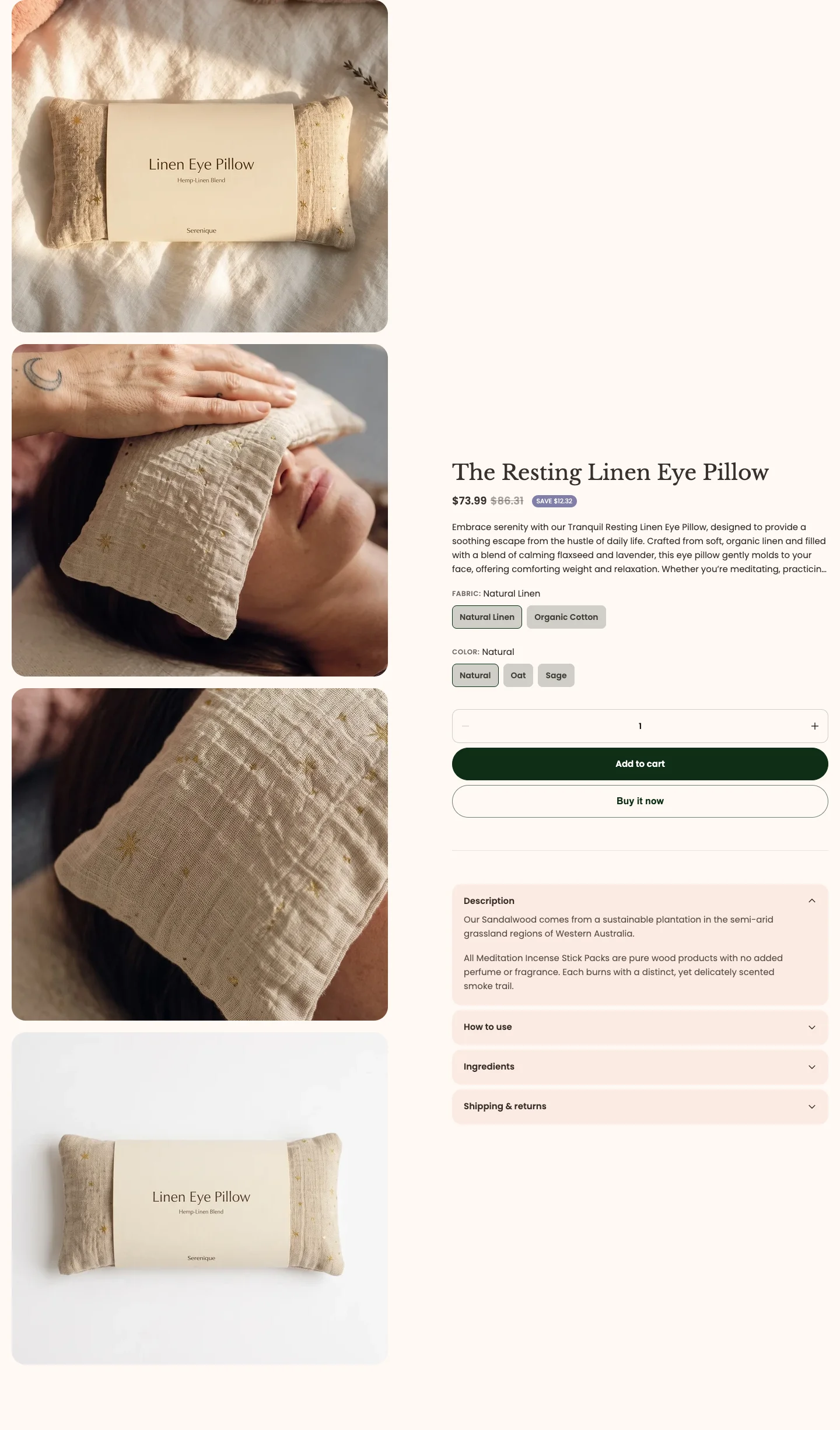
Section settings:
- Media type: Show the product media as Carousel horizontal, Carousel vertical, Grid, or Stack.
- Media columns: Lay the media out in 1 column or 2 columns.
- Media position: Place the media on the Left or Right of the product details.
- Thumbnail position: Show the thumbnails Inside main media or Below main media. Desktop only; on mobile the thumbnails always sit below.
- Gap: The space between the media and the product details.
- Enable sticky cart: Show a bar with the add to cart button that stays on screen as the customer scrolls past the buy buttons.
- Sticky cart type: Choose Quick add or Standard add for the sticky bar.
Blocks:
- Media: The product gallery, with Media sticky, Hide other variants’ media after selecting a variant, and Enable image zoom.
- Product vendor, Product title, and Price: The product's vendor, name, and price.
- Product description: Show the Full description or Limited lines, with the number of Visible lines.
- Variant picker: Show options as Dropdowns or Buttons, with optional Swatches, a Horizontal or Vertical direction, and an alignment.
- Buy buttons: Quantity, add to cart, and buy now, in a Quantity top, Buy now bottom, or All stacked layout. Also controls Show dynamic checkout buttons and Show recipient information form for gift cards.
- Inventory status: Show stock as a Badge or Progress bar, with a Low inventory threshold and Show inventory count.
- Pickup availability: Show nearby pickup locations when local pickup is set up for your online store.
- Countdown timer: Counts down to the date and time in the product's
theme.product_countdownmetafield (orcustom.product_countdown). Products without the metafield show no timer. See Product metafield data. - Spacing and Divider: Add vertical space or a line between blocks.
- Text: A short piece of rich text, with size and color.
- Collapse: One collapsible row with a heading and content, optionally open by default. Add one block per row.
- Videos: A grid of product videos, with heading, aspect ratio, columns, and play button settings.
- Recommended products: Complementary products set up in the Search & Discovery app.
- Promo banner: An icon, headline, and label in a colored panel. Up to three per product.
- Support information: One reassurance line with an icon. Blocks placed next to each other are grouped into one panel.
- Line item property: A Text, Checkbox, Radio, or Dropdown field that collects customization information with the item. See Product line item properties.
- Custom Liquid: App snippets or other Liquid code.
- Apps: App blocks from installed Shopify apps.
Collection templates
Mind includes three collection layouts for products and three for services.
| Template | Sections included |
|---|---|
Collection (default) — collection.json | Image banner, Page title, Collection circles, Main collection, Call to action |
Collection 2 — collection.collection-2.json | Page title, Collection circles, Main collection, Collection categories |
Collection 3 — collection.collection-3.json | Main collection, Collection categories |
Service 1 — collection.service-1.json | Image banner, Page title, Main collection, Call to action |
Service 2 — collection.service-2.json | Page title, Collection stack list, Banner with card |
Service 3 — collection.service-3.json | Page title, Products scroll showcase, Banner with card |
Collection and Collection 2 place a Box banner inside the product grid, Collection 3 adds a Sidebar block beside it, and Service 1 uses vertical filters for a service listing. Service 2 and Service 3 skip the product grid and present the collection as a stacked list or a scrolling showcase instead. To assign a layout to a collection, follow Change the collection template.
Main collection
The Main collection section renders the product grid, filters, sorting, and pagination.
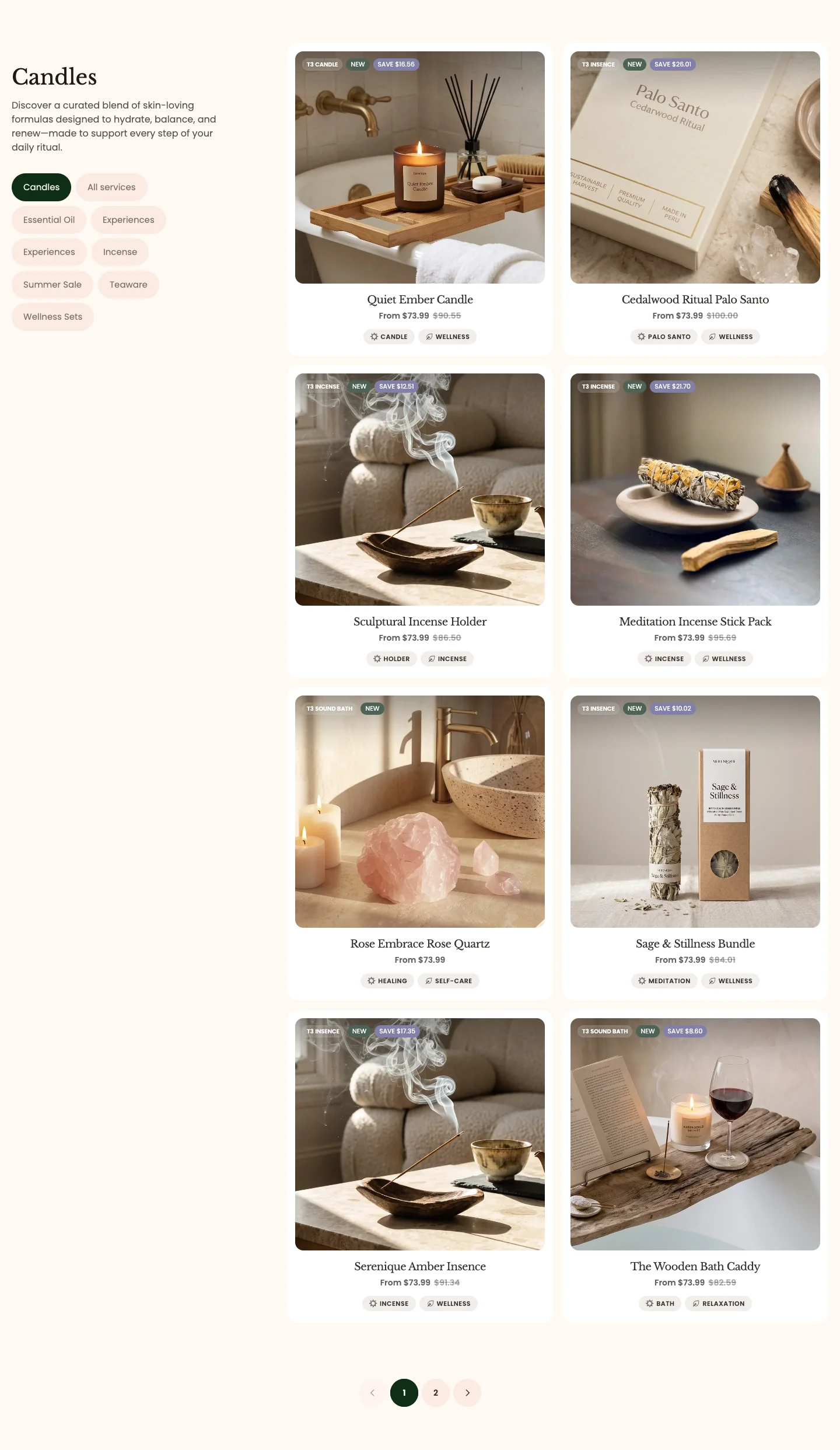
Section settings:
- Products per page and Load more type: Page through products with Pagination, Load more on scroll, or a Load more button.
- Columns, Columns mobile, and Gap: The grid layout.
- Filter type: Show filters as a Horizontal bar above the grid, a Vertical column beside it, or a Drawer opened from a button.
- Filtering, Sorting, and Grid layout control: Turn each control on or off.
- Filter bar appearance: Text color, background color, and corner radius of the filter bar.
- Product card: Aspect ratio, Show price, Show description, Show properties on the image, and Show tag.
Blocks:
- Box banner: An image banner placed inside the product grid, with Banner position, Column span desktop, Row span desktop, a link, desktop and mobile images, an overlay color, and corner radius.
- Sidebar: A text column next to the grid, with Sidebar column width, Sidebar position (Left or Right), a heading, and a description.
Blog and article templates
| Template | Sections included |
|---|---|
Blog (default) — blog.json | Page title, Main blogs, Call to action |
Blog 2 — blog.blog-2.json | Page title, Main blogs, Call to action |
Blog 3 — blog.blog-3.json | Page title, Main blogs, Call to action |
Article — article.json | Main article, Blog post, Call to action |
The blog listing uses the Main blogs section, which shows a row of Category tag blocks above the articles. Blog 2 and Blog 3 turn on Highlight the first article; Blog 2 uses the Vertical card layout and Blog 3 the Horizontal one. Each post uses the Main article section, built from the Published, Title, Share, Featured image, Table of contents, Promo, and Content blocks, with a Blog post section beneath it to suggest more reading.
Page templates
| Template | Sections included | Best for |
|---|---|---|
Page (default) — page.json | Page | Any standard page: policies, shipping information, general content |
About — page.about.json | Hero banner highlight, Collage carousel, Logo list, Image with text, Team grid, Milestones, Image with marquee, Image with text service | Brand story with team and milestones |
About 2 — page.about-2.json | Hero banner insight, Section, Video, Counter grid, Product scroll horizontal, Collage grid, Scrolling text, Image with text service | Founder story with numbers and products |
About 3 — page.about-3.json | Hero banner insight, Section, Video, Counter grid, Collage masonry, Scrolling text, Image with text service | Founder story with an image collage |
Contact — page.contact.json | Contact, FAQs, Store locator | Contact form, common questions, and store addresses |
List collections 2 — page.list-collections-2.json | Page title, Hero banner with video, Collections, Image comparison | An alternative collections overview page |
Recently viewed — page.recently-viewed.json | Recently viewed | A page listing the products the customer viewed last |
Testimonial 1 — page.testimonial-1.json | Image banner, Page title, Testimonials grid, Call to action | A reviews page with a banner header |
Testimonial 2 — page.testimonial-2.json | Testimonials grid, Scrolling text, Image with text service | A reviews page |
Testimonial 3 — page.testimonial-3.json | Testimonials grid, Scrolling text, Image with text service | A second variant of the Testimonial 2 layout, ready for a different set of reviews |
Assign these from the page's Theme template dropdown in Online Store > Pages. The default page uses the Page section, which renders the page title and content and has Make section narrow, heading size, alignment, tag, and text size settings.
Special page templates
| Template | Sections included | Description |
|---|---|---|
Cart — cart.json | Breadcrumb, Main cart, Featured collection | The full cart page |
Search — search.json | Search, Main search | Search header, then results with filters and sorting |
List collections — list-collections.json | Image banner, Collections, Collection showcase tabs, Image comparison | The /collections page listing every collection |
404 — 404.json | Main 404 | Page not found |
Password — password.json | Password header, Main password, Password footer | The storefront password page shown while the store is locked |
Gift card — gift_card.liquid | — | A Liquid template that shows the gift card balance and code, with a copy button, QR code, Apple Wallet link, and print option |
Main cart
The Main cart section lists the line items with the order summary and checkout. The cart note, discount field, and free shipping message follow the options in Online Store > Customize > Theme settings > Cart.

Blocks:
- Cart attributes: A Default (text), Checkbox, Radio, or Dropdown field that collects extra information with the order. See Cart attributes.
- Subtotal price: The cart subtotal, discounts, and tax note.
- Checkout button: The checkout button.
- Apps: App blocks from installed Shopify apps.
Main password
Main password is the main section of the password page and the only main section with a preset. It shows a heading, a description, and a newsletter signup so visitors can ask to be told when the store opens.
section-main-password.webp
Features:
- Style: Default or Glass, a frosted card over the background.
- Heading, heading size, and description
- Button label, style, and size for the signup button
- Color, gradient, or image background with overlay
- Password header above it shows your logo and the password entry form; Password footer below it shows the "Powered by Shopify" line and the admin login link. Both have only color and padding settings.
Customer account templates
Mind 1.0.0 does not ship customer account templates; the templates/customers folder is empty. Login, registration, order history, and address pages are served by Shopify's new customer accounts, which you manage in Settings > Customer accounts. Those pages use Shopify's own layout and branding settings rather than theme sections.
Main page sections
Each template is anchored by a main section that renders the page's core content. These sections have no presets (Main password is the one exception) and come with their template.
| Section | Template | What it renders |
|---|---|---|
| Main product | Product, Product 2, Service detail 1 | Media, title, price, variant picker, buy buttons, and the product blocks |
| Main collection | Collection, Collection 2, Collection 3, Service 1 | Product grid, filters, sorting, and pagination |
| Main cart | Cart | Line items, cart attributes, note, discounts, and the order summary |
| Main article | Article | Published date, title, share links, featured image, table of contents, promo, content, and comments |
| Main blogs | Blog, Blog 2, Blog 3 | Category tags and the article listing |
| Page | Page | Page title and rich text content |
| Collections | List collections, List collections 2 | The grid of all collections |
| Search | Search | The search header and search field |
| Main search | Search | Search results for products and articles, with filters and sorting |
| Main 404 | 404 | An image, the not found message, and a button back into the store |
| Main password | Password | The message and newsletter signup, between the Password header and Password footer |
How to assign a template
Templates are assigned per resource in the Shopify admin, not in the theme editor.
- In your Shopify admin, open the resource you want to change, for example Products > [product], Products > Collections > [collection], or Online Store > Pages > [page].
- Scroll to the Theme template card in the right-hand column (on some pages it is titled Online store).
- Open the dropdown and choose the template, for example product-2 for a product, service-1 for a collection, or about for a page.
- Click Save. The page now renders with the sections of that template.
For step-by-step walkthroughs, see Change the homepage preset, Change the collection template, and Change the product template.
To create a new template variant, open the theme editor, pick the page type from the top dropdown, and click Create template. Base it on the existing template that is closest to what you want, then adjust its sections.