Change collection template
This guide describes how to assign one of Mind's collection page layouts to a collection.
Mind includes six collection templates. Three are product grids built on the Main collection section, with filtering and sorting, and three are service layouts for collections of classes, sessions or projects.
| Template | Sections | Layout |
|---|---|---|
| collection (default) | Image banner, Page title, Collection circles, Main collection, Call to action | 4-column grid with horizontal filters, sorting and a Box banner placed inside the grid |
| collection.collection-2 | Page title, Collection circles, Main collection, Collection categories | 4-column grid with horizontal filters, sorting and a Box banner, followed by a list of other collections |
| collection.collection-3 | Main collection, Collection categories | 2-column grid beside a Sidebar with a heading and description; filtering and sorting turned off |
| collection.service-1 | Image banner, Page title, Main collection, Call to action | 3-column grid that hides prices and shows each product's description, properties and tags |
| collection.service-2 | Page title, Collection stack list, Banner with card | The collection's products as large stacked cards, 4 per page |
| collection.service-3 | Page title, Products scroll showcase, Banner with card | Hand-picked products in a scrolling showcase |
Assign a template to a collection
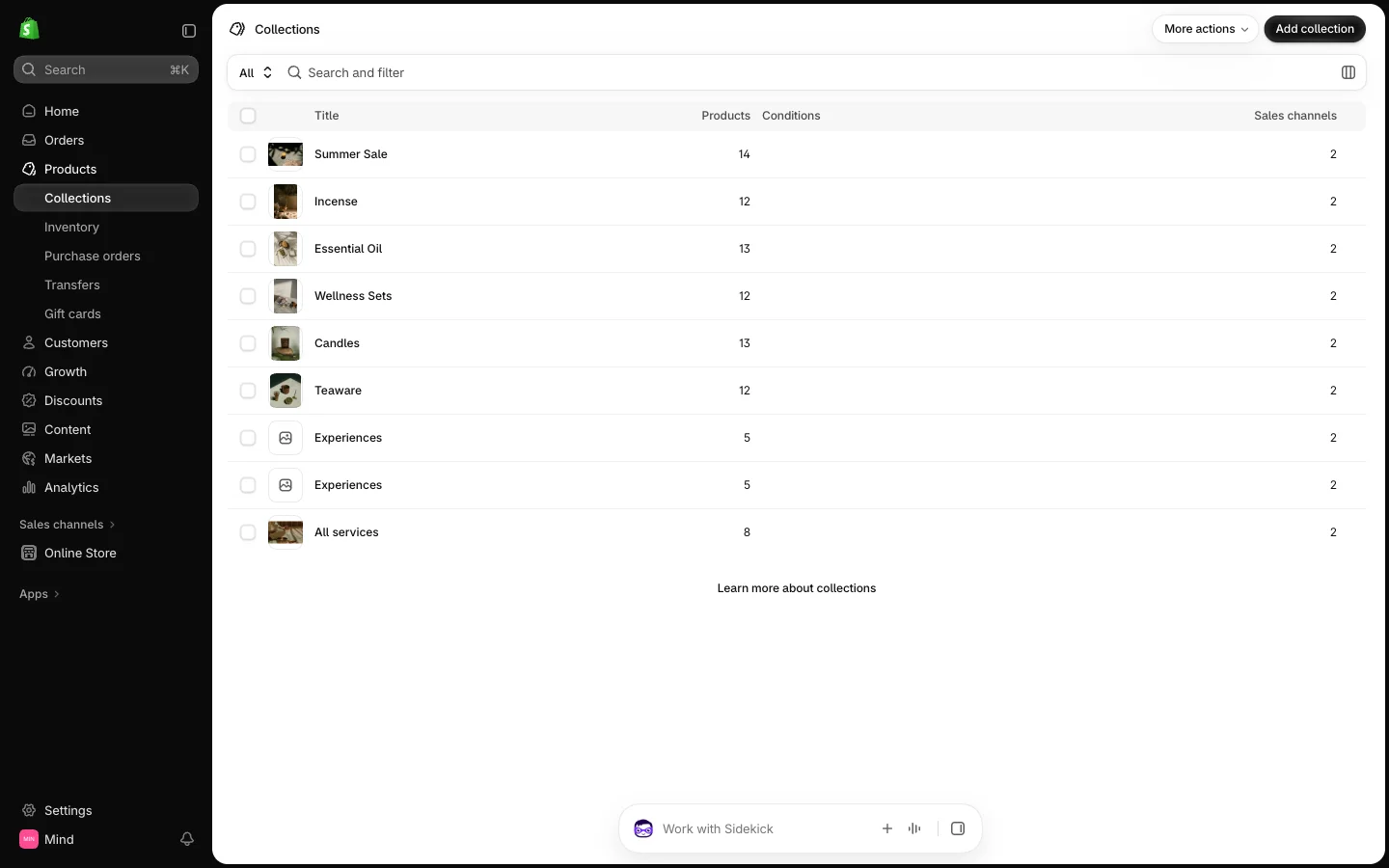
- On your store's Shopify admin page, from the left-side menu, select Products > Collections, then select the collection you want to change.
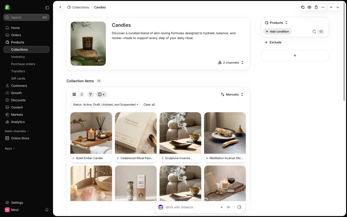
- On the collection page, find the Theme template box and select the template you want: Default collection, collection-2, collection-3, service-1, service-2 or service-3.
- Select Save.
Edit the layout
- Open the Theme editor (Sales channels > Online store > Themes > Customize).
- From the page selector at the top, select Collections and the template you assigned.
- Select the Main collection section in the sidebar to edit the product grid:
- Products per page and Load more type: Pagination, Load more on scroll or Load more button.
- Columns, Columns mobile and Gap: the grid layout.
- Filter type: Horizontal, Vertical or Drawer, with Filtering, Sorting and Grid layout control switches.
- Product card: Aspect ratio, Show price, Show description, Show properties on the image and Show tag.
- Use the section's blocks to change the grid: Box banner places a linked image inside the grid at the Banner position you choose, and Sidebar adds a text column (Sidebar column, Sidebar position, Heading, Description) beside the products.
- Select Save.
The Collection stack list section in service-2 reads the products of the collection being viewed, so you can assign it to any collection. The Products scroll showcase section in service-3 shows the products you pick in its Product blocks, not the collection's products, so set those blocks for each collection that uses the template.
Use the default or collection-2 template for stores with many products and filters, collection-3 for a short, curated collection with an introduction, and the service templates for classes, workshops or projects where a description matters more than a price. Section-by-section details are on the Collection sections and Product sections pages.