Collection Sections
Collection sections help visitors browse your catalog by collection, from compact circle rows and text lists to marquees, hover showcases, and a stacked product list for collection pages. Mind includes 6 collection sections. Each also has the universal color scheme, background, and padding controls described in Section Settings, so this page only lists what is specific to each section.
Every section on this page except Collection stack list starts from a Collections picker. Until you pick collections, the section shows placeholder cards so you can preview the layout.
Collection categories
A typographic list of collection names, each with an arrow that animates on hover. Use it as a "shop by category" index; it appears on the second and third collection templates.

Features:
- Collections picker that sets the list of collection links
- Header with a Heading and Heading animation (Global, Scroll, or Reveal)
- Items: Text color and Background color for each collection link, chosen from the theme palette or a custom color, each with its own opacity
Collection circles
A row of round collection images with their titles, often placed at the top of a collection page as quick category links. It appears on the default and second collection templates.

Features:
- Collections picker
- Header with a Heading, Heading size, and a Show breadcrumb option for collection pages
- Layout: Grid or Carousel, with Carousel on mobile, columns for desktop and mobile, and a Global or Custom gap
- Image size to set the diameter of each circle
Collections
A heading and button above a grid or carousel of collection cards. It is the main "shop by collection" section on the home page.
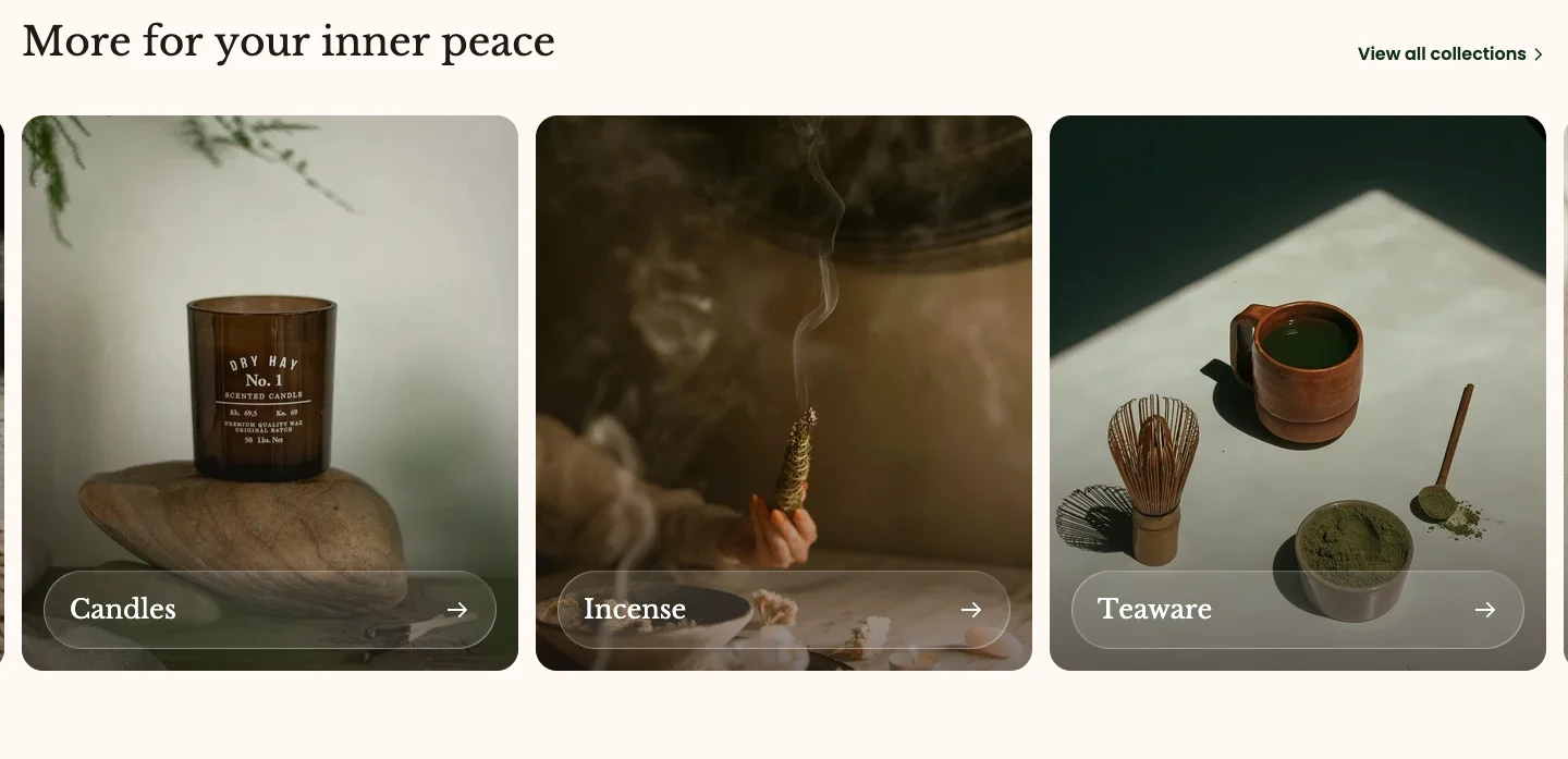
Features:
- Collections picker
- Header with a Heading, Heading size, and Heading animation
- Layout: Grid or Carousel, with Carousel on mobile, columns for desktop and mobile, and a Global or Custom gap
- Navigation color scheme for the carousel arrows
- Button with label, link, Button preset, Button style, and Button size
- Collection card: Color scheme, Aspect ratio (Auto, 3:4, 1:1, 4:3, 16:9, or Custom with width and height ratio), and Corner radius
Collection marquee
Collection cards that scroll in a continuous marquee, with an optional banner and a row of scrolling words. Use it for a lively "explore our collections" band; it appears on the third home page layout.
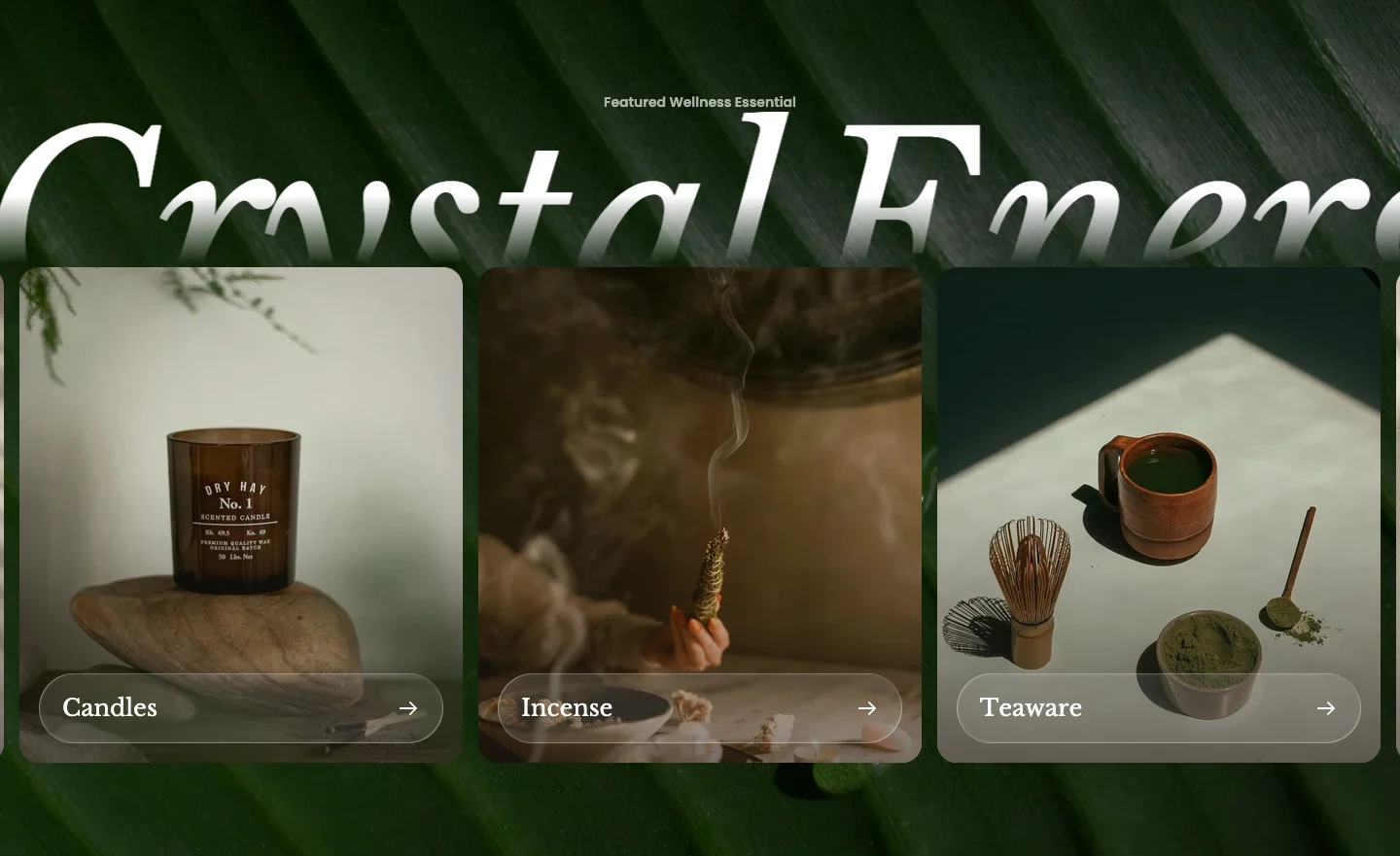
Features:
- Collections picker and a Style of Marquee or Banner
- Header with a Sub heading and a rich text Text
- Banner: Banner image, Banner corner radius, and Banner colors
- Layout: Grid or Carousel, with Carousel on mobile, columns for desktop and mobile, and a Global or Custom gap
- Marquee: Direction (Forward or Backward), Pause on hover, Sync with page scroll, Speed, and item spacing for desktop and mobile
- Collection card: Color scheme, Aspect ratio, and Corner radius
- Section background can also be an image, with separate desktop and mobile images, parallax, and a color or gradient overlay
- Blocks: Text (a rich text word or phrase added to the scrolling row)
Collection showcase tabs
A list of collection titles that swaps a large collection image as the customer hovers over each name. It appears on the collections list page.
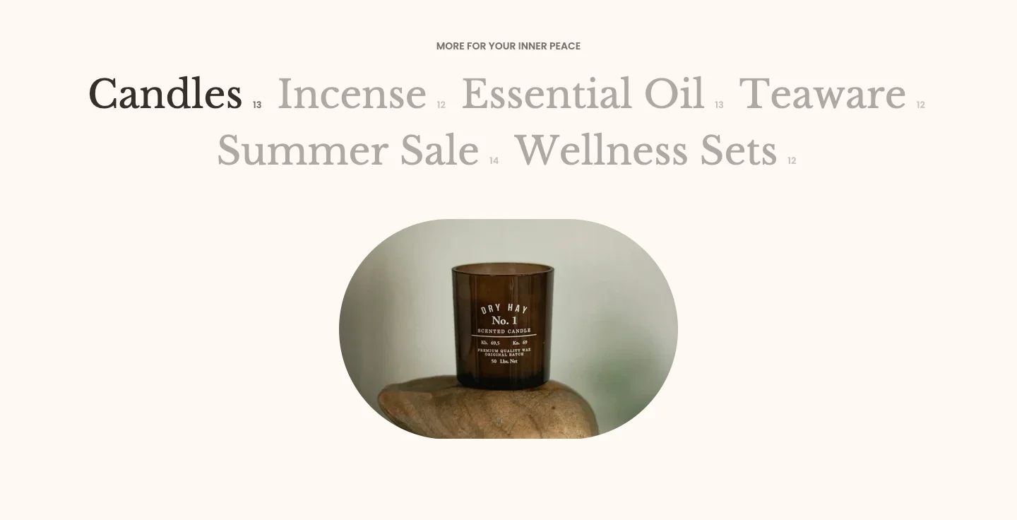
Features:
- Style: Centered or Two columns
- Collections picker
- Header with a Sub heading, Heading, and Heading animation
- Image width: Fill or Custom width
- Aspect ratio for desktop and mobile separately (Auto, 3:4, 1:1, 4:3, 16:9, or Custom)
- Image shape: None, Arch, Arc Corner, Wavy Blob, Convex, Hourglass, Cloud, Butterfly, Petal Shield, Flower Quad, Layered Oval, or Stamp
- Corner radius
Collection stack list
The products of one collection shown as large stacked cards with a button on each, paged like a collection grid. It can only be added to collection templates and is used by the second service collection template.
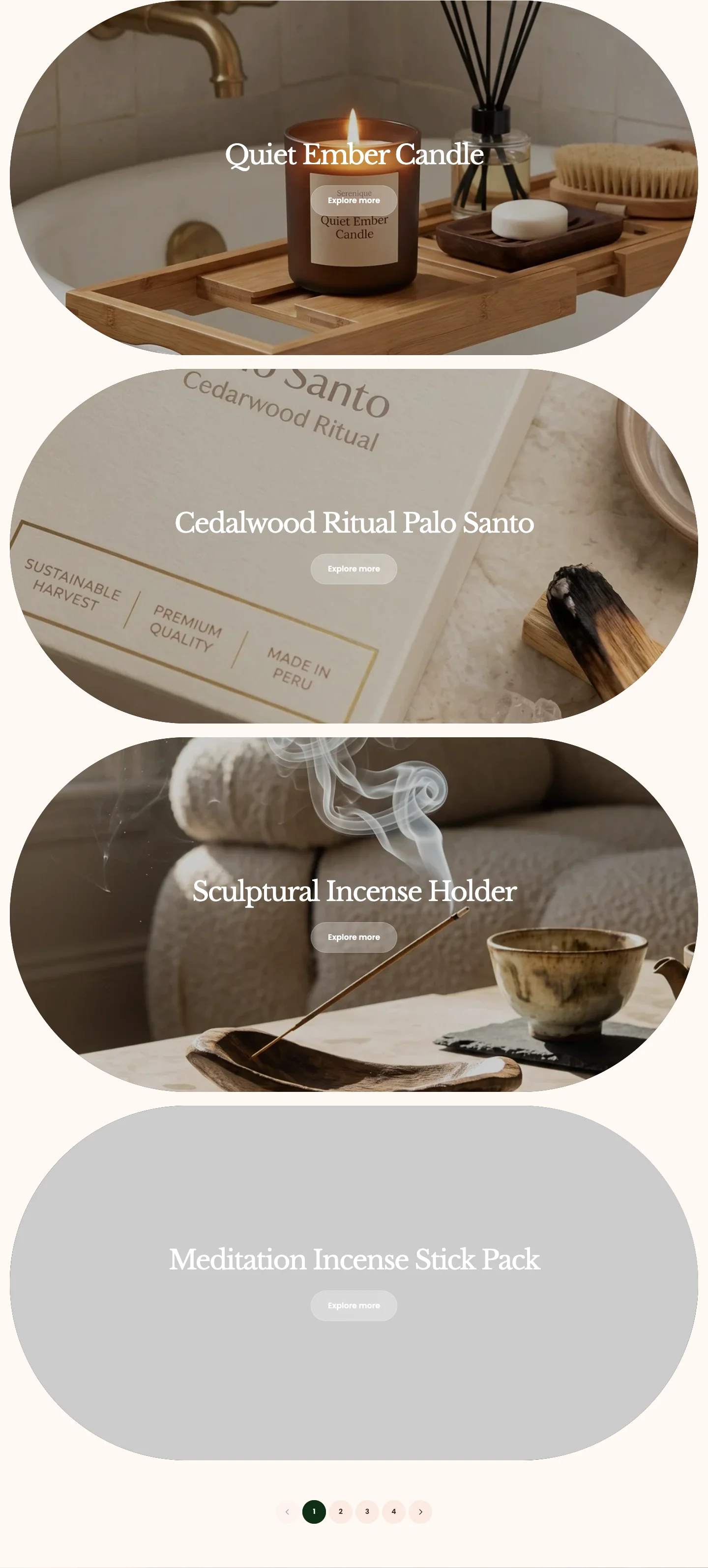
Features:
- Collection to list products from
- Products per page, with Show more set to Pagination, Load more on scroll, or Load more button
- Spacing: Global or Custom spacing between cards
- Card: Aspect ratio and Corner radius set separately for desktop and mobile, plus Card colors
- Content style: Plain or Panel, with a Panel width for the panel style
- Button with label, Button preset, Button style, and Button size
See Change collection template to assign a service collection template to a collection.
- Use Collection circles for compact category links at the top of a page.
- Use Collections when you want a classic grid or carousel of collection cards with a button.
- Use Collection marquee for a moving band of collections on the home page.
- Use Collection categories or Collection showcase tabs for a type-led list; the showcase adds a hover image.
- Use Collection stack list on a collection template to present each product as a large card.