Editorial Sections
Editorial sections tell your brand story. They pair large type with images, milestones, numbers, and people, so they suit About pages, landing pages, and the narrative parts of a home page. Mind includes 14 editorial sections. All of them share the universal color scheme, background, and padding controls described in Section Settings.
Most editorial sections include a Heading animation setting. Choose Global to follow your theme settings, Scroll to animate the heading as it scrolls into view, or Reveal to reveal it line by line.
Image with text
A text column with a heading, description, and button, paired with a main image and a second image. It is used by the home page and the page.about template.
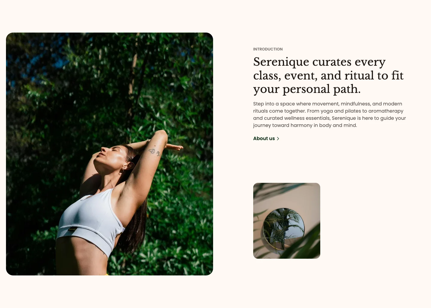
Features:
- Sub heading and heading with heading size and animation, plus a rich text description
- Button with label, link, preset (including Underline out and Underline in), style, and size
- Image with aspect ratio (Auto, 3:4, 1:1, 4:3, 16:9, or Custom)
- Second image with its own aspect ratio and a link
Image with text about
A short brand statement beside an image. It appears on the fourth home page layout.
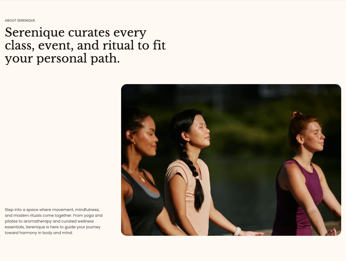
Features:
- Sub heading and heading with heading size and animation
- Rich text supporting copy
- Image with corner radius
Image with text feature
A profile-style feature for introducing a founder, coach, or expert: a title, a highlighted number such as years of experience, a name and description, and a shaped image. It is used by the home page.
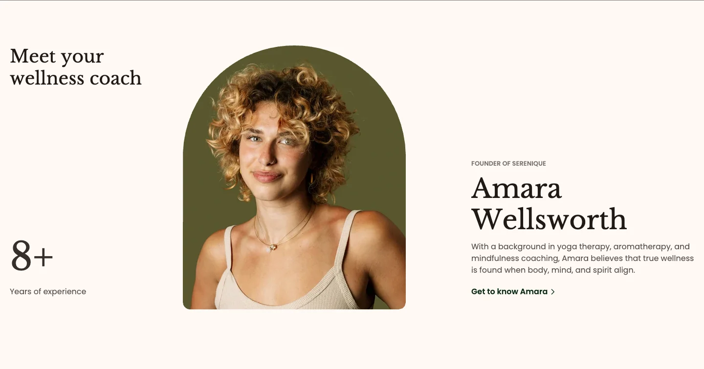
Features:
- Title above the content
- Count with a number, text after the number (for example + or %), and a count label
- Sub heading and heading with heading size and animation, plus a rich text description
- Button with label, link, preset (including Underline out and Underline in), style, and size
- Image with a link, corner radius, and an image shape (None, Arch, Arc Corner, Wavy Blob, Convex, Hourglass, Cloud, Butterfly, Petal Shield, Flower Quad, Layered Oval, or Stamp)
Image with text insight
An image with a decorative shape behind it next to a content panel with a heading, description, button, and up to three counts. It appears on the third, fourth, and fifth home page layouts.
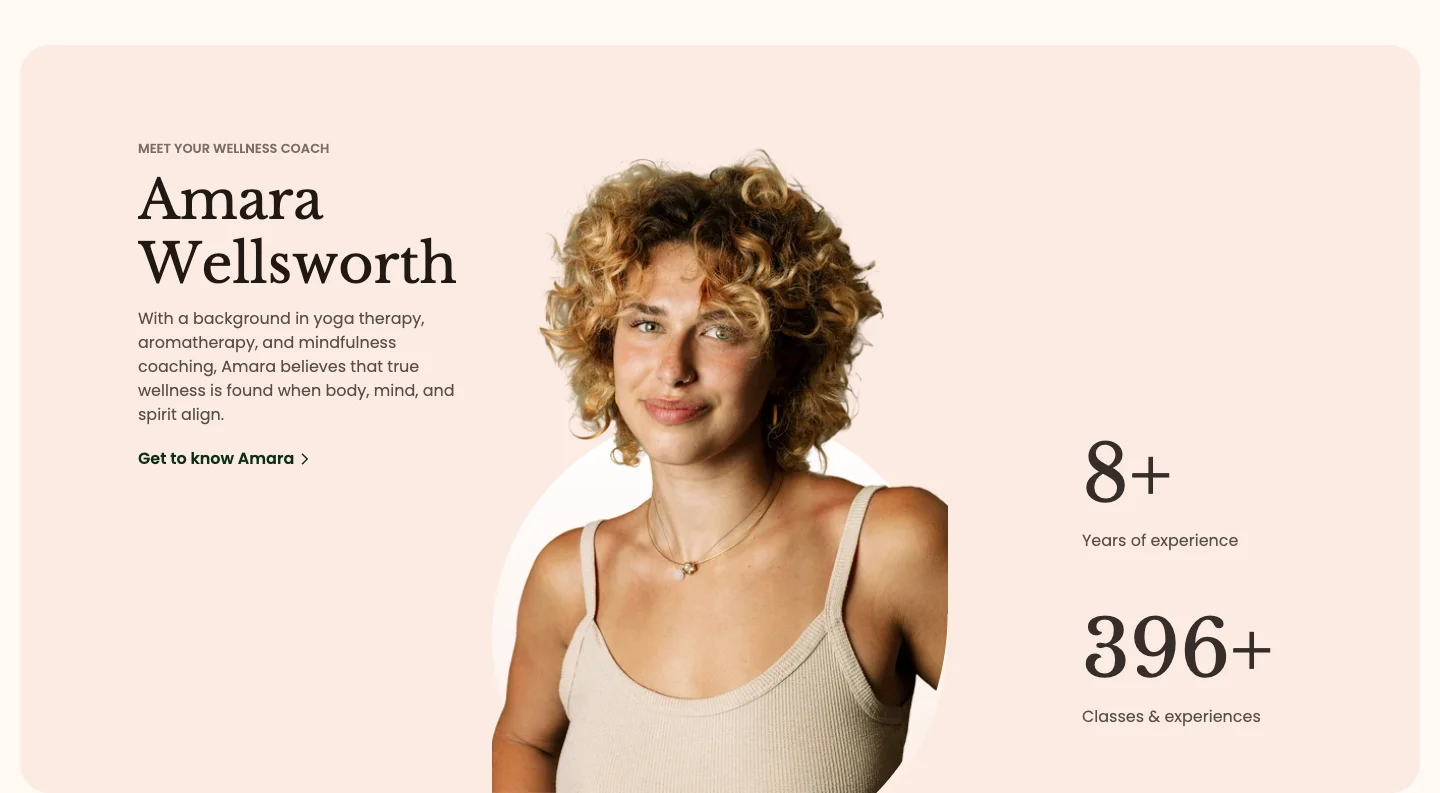
Features:
- Sub heading and heading with heading size and animation, plus a rich text description
- Button with label, link, preset (including Underline out and Underline in), style, and size
- Image with a decorative shape (Glow or Circle) and a shape color
- Content panel with its own color scheme, background color, and corner radius
- Up to 3 counts, each with a number, text after the number, and a label
- Blocks: Count
Image with text service
A call-to-action style section with a heading, description, and button beside a shaped image, for example to invite visitors to book a consultation. It is used by the page.about templates and several home page layouts.
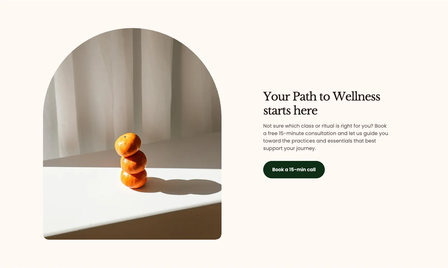
Features:
- Heading with heading size and animation, plus a rich text description
- Button with label, link, preset, style, and size
- Image with a link, corner radius, and an image shape (None, Arch, Arc Corner, Wavy Blob, Convex, Hourglass, Cloud, Butterfly, Petal Shield, Flower Quad, Layered Oval, or Stamp)
Image with milestone
A heading and a list of milestones, such as founding years or key figures, beside two overlapping images.
section-image-with-milestone.webp
Features:
- Sub heading and heading with heading size and animation
- Milestone size (Small, Medium, Large, or Extra large)
- Image and a second image that sits over the top-right corner of the first
- Milestones with a label and a value (a year or a short number, for example 2020)
- Blocks: Milestone
Image parallax with text
A centered brand statement surrounded by up to three images that move at different speeds as you scroll. It appears on the second and third home page layouts.
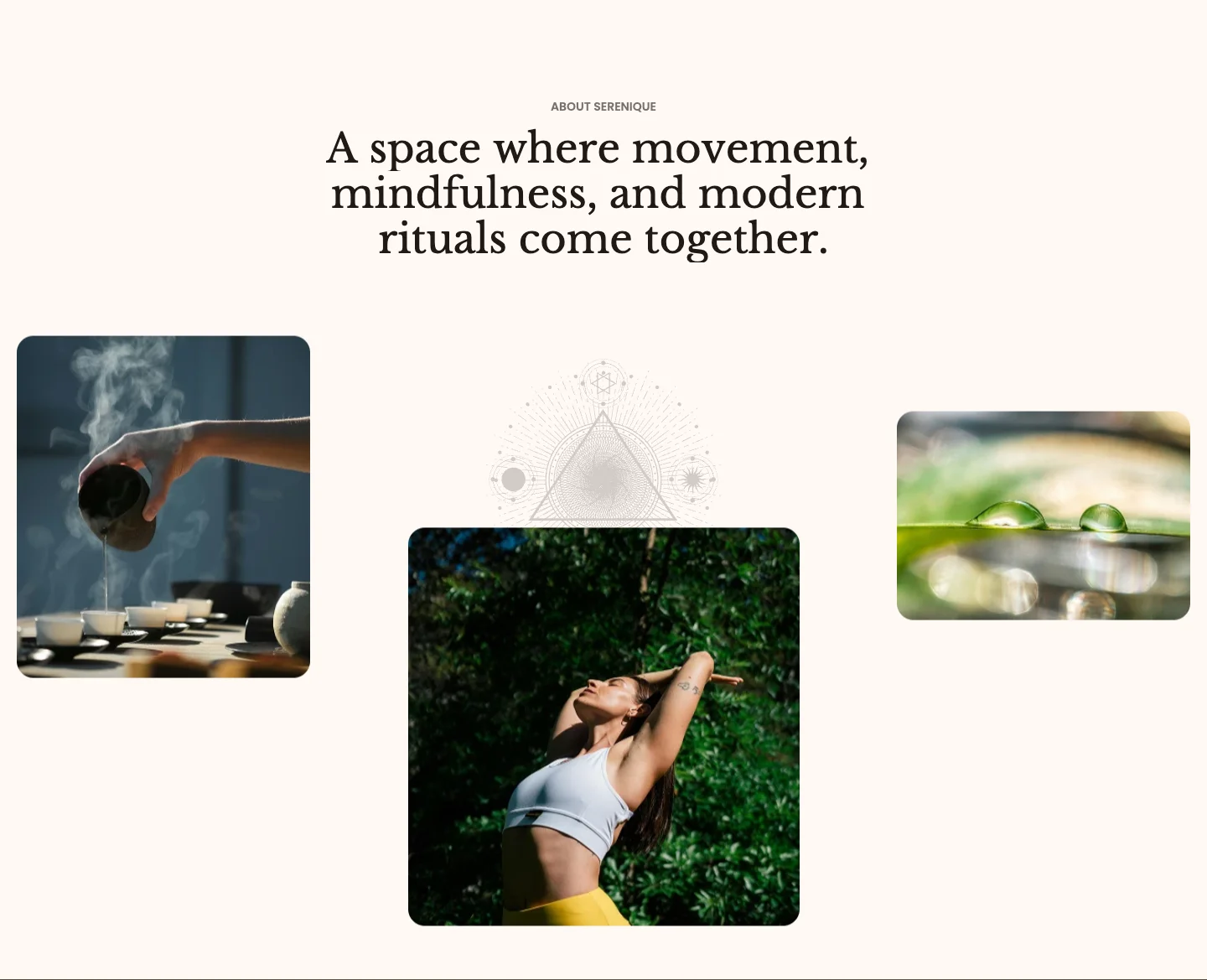
Features:
- Sub heading and heading with heading size, animation, and header max width
- Decoration image shown with the heading
- Up to 3 images, each with its own aspect ratio width and height; their positions and parallax direction are set by their order
- Blocks: Image
Milestones
An interactive brand history. Each milestone is a tab whose label also appears as an oversized year, and selecting it swaps the heading, description, and the two images around it. It is used by the page.about template.
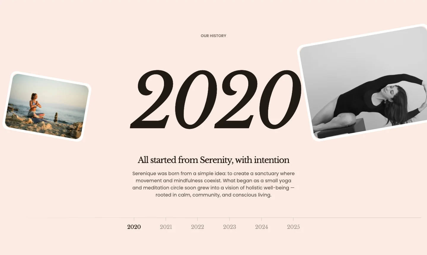
Features:
- Sub heading and year style (Solid or Gradient)
- Milestones with a label, a rich text heading, and a description
- Left and right images per milestone, each with aspect ratio and corner radius
- Content layout per milestone: direction, alignment, position, gap, and padding
- Blocks: Time
Timeline
A heading above a chronological list of milestones, each with a year, a title, and a short description.
section-timeline.webp
Features:
- Heading with heading size and animation
- Milestones with a year, heading, and rich text description
- Blocks: Milestone
Counter grid
A row of statistics that count up from a start value to an end value. It is used by the page.about-2 and page.about-3 templates.

Features:
- Layout: Centered or Bordered
- Statistics with a start value, end value, duration, and time delay
- Text after the number (for example + or %) and a label
- Blocks: Statistic
Logo list
A sub heading above a scrolling marquee of partner or press logos. It is used by the page.about template.

Features:
- Section width (Global, Boxed, or Fill) with a custom width
- Sub heading
- Logo height and logo spacing for desktop and mobile
- Marquee direction, speed, and pause on hover
- Blocks: Logo
Team grid
A header above a grid or carousel of team member cards. It is used by the page.about template.
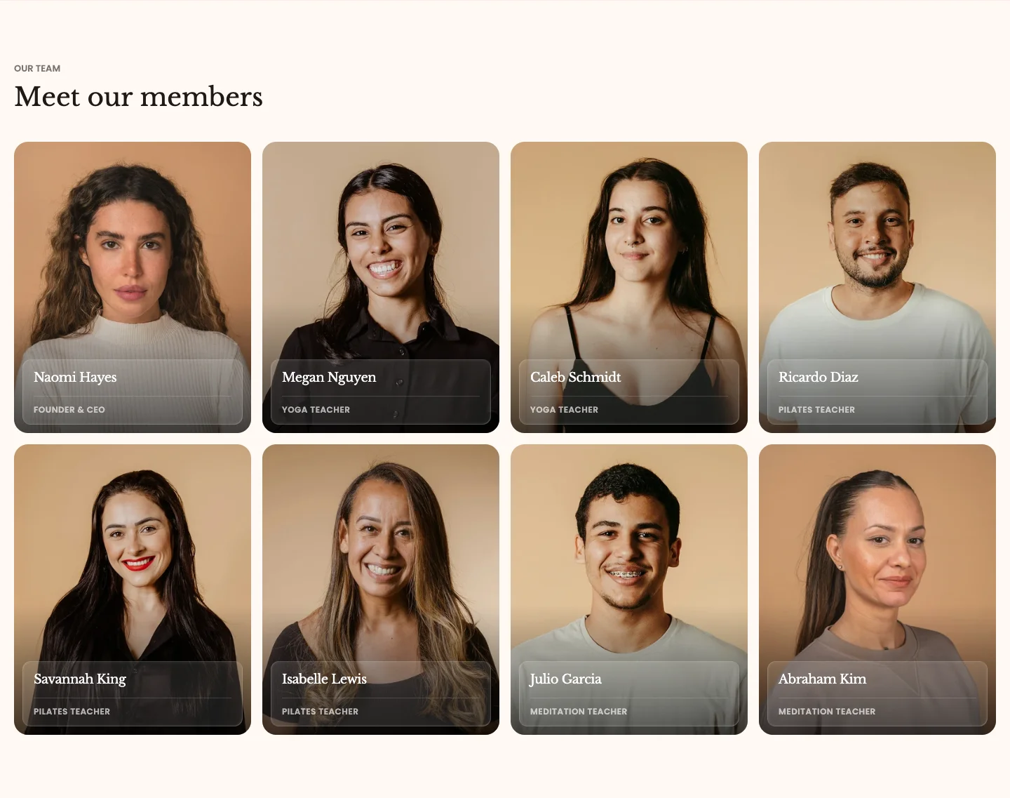
Features:
- Sub heading and heading with heading size and animation
- Grid or Carousel layout, carousel on mobile, columns and gap for desktop and mobile
- Card aspect ratio (Auto, 3:4, 1:1, 4:3, 16:9, or Custom) and corner radius
- Members with an image, name, and role
- Blocks: Member
Team members
A header above a grid or carousel of team member portraits, with a shared image ratio.
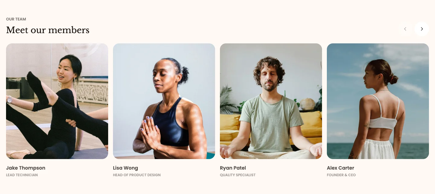
Features:
- Sub heading and heading with heading size and animation
- Image aspect ratio (Auto, 3:4, 1:1, 4:3, 16:9, or Custom)
- Grid or Carousel layout, carousel on mobile, columns and gap for desktop and mobile
- Members with an image, name, and role
- Blocks: Member
Team spotlight
A featured team member, such as your founder, presented with a larger image and description, alongside a list of other members.
section-team-spotlight.webp
Features:
- Sub heading and heading with heading size
- Featured member with an image, name, role, and description
- Members with an avatar, name, role, and description
- Blocks: Member
- Start with Image with text or Image with text about for your brand statement.
- Tell your history with Milestones for an interactive story, or Timeline for a simple list.
- Add proof with Counter grid and Logo list, then introduce your people with Team grid, Team members, or Team spotlight.