Product Sections
Product sections cover every way of showing products outside the main product page: grids and carousels, scroll-driven rows, tabbed and stacked layouts, comparison, and the overlays that let customers buy from anywhere in the store. Mind includes 16 product sections: thirteen sections you can add to pages and three overlay sections that live in the Overlay section group. The main product section is documented with the product templates in Page Templates.
Most sections on this page share a Header group (Sub heading, Heading, Heading size, and Heading animation set to Global, Scroll, or Reveal) and a Product card group with an Aspect ratio (3:4, 1:1, 4:3, 16:9, or Custom with width and height ratio) and a Show price toggle. The universal color scheme, background, and padding controls are described in Section Settings.
Featured collection
A heading and description above a grid or carousel of product cards from a collection or a hand-picked list. It is the standard product row on the home page and appears below the cart on the cart page.
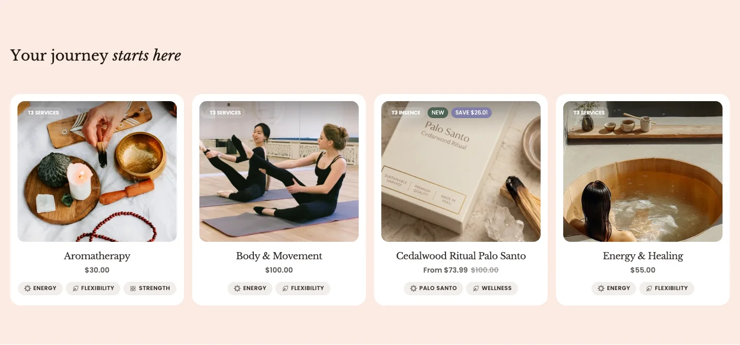
Features:
- Source products from a Collection or a Products list, with Number of products to show
- Header with Sub heading, Heading, Heading size, Heading animation, and a rich text Description
- Layout: Grid or Carousel, with Carousel on mobile, columns for desktop and mobile, and a Global or Custom gap
- Product card: Aspect ratio, Show price, and Show tag
Featured product
A single product with its gallery and buy box, placed on any page. Use it to spotlight a hero product with a working add-to-cart.
section-featured-product.webp
Features:
- Product to feature
- Media type: Carousel horizontal, Carousel vertical, Grid, or Stack, with Media position (Left or Right) and Thumbnail position (Inside main media or Below main media)
- Sticky cart: Enable sticky cart, with a Sticky cart type of Quick add or Standard add
- Enable navigation and Gap for the gallery
- Navigation settings: Icon size, button Width and Height, Icon color, Background color, Border, Corner radius, and Shadow, each with opacity and custom color options
- Blocks: Media, Product vendor, Product title, Product description, Price, Variant picker, Buy buttons, Inventory status, Pickup availability, Countdown timer, Spacing, Divider, Text, Collapse, Videos, Recommended products, Promo banner, Support information, Line item property, View details, and app blocks
The product blocks work the same way as on the main product section. See Page Templates and the Product line item properties guide.
Collection tabs
A row of collection tabs over a product grid. Clicking a tab swaps the grid to that collection's products.
section-collection-tabs.webp
Features:
- Collections picker for the tabs, with a Default active collection
- Products to show per tab
- Tab style: Bar, Simple, Card, or Pills
- Header with Sub heading, Heading, Heading size, and Heading animation
- Layout: Columns desktop, with a Global or Custom gap for desktop and mobile
- Product card: Aspect ratio, Show price, and Show tag
Collection with banner
A product grid with a promotional banner placed inside it as one of the cards. You choose which grid cell the banner starts in and how many columns and rows it spans.
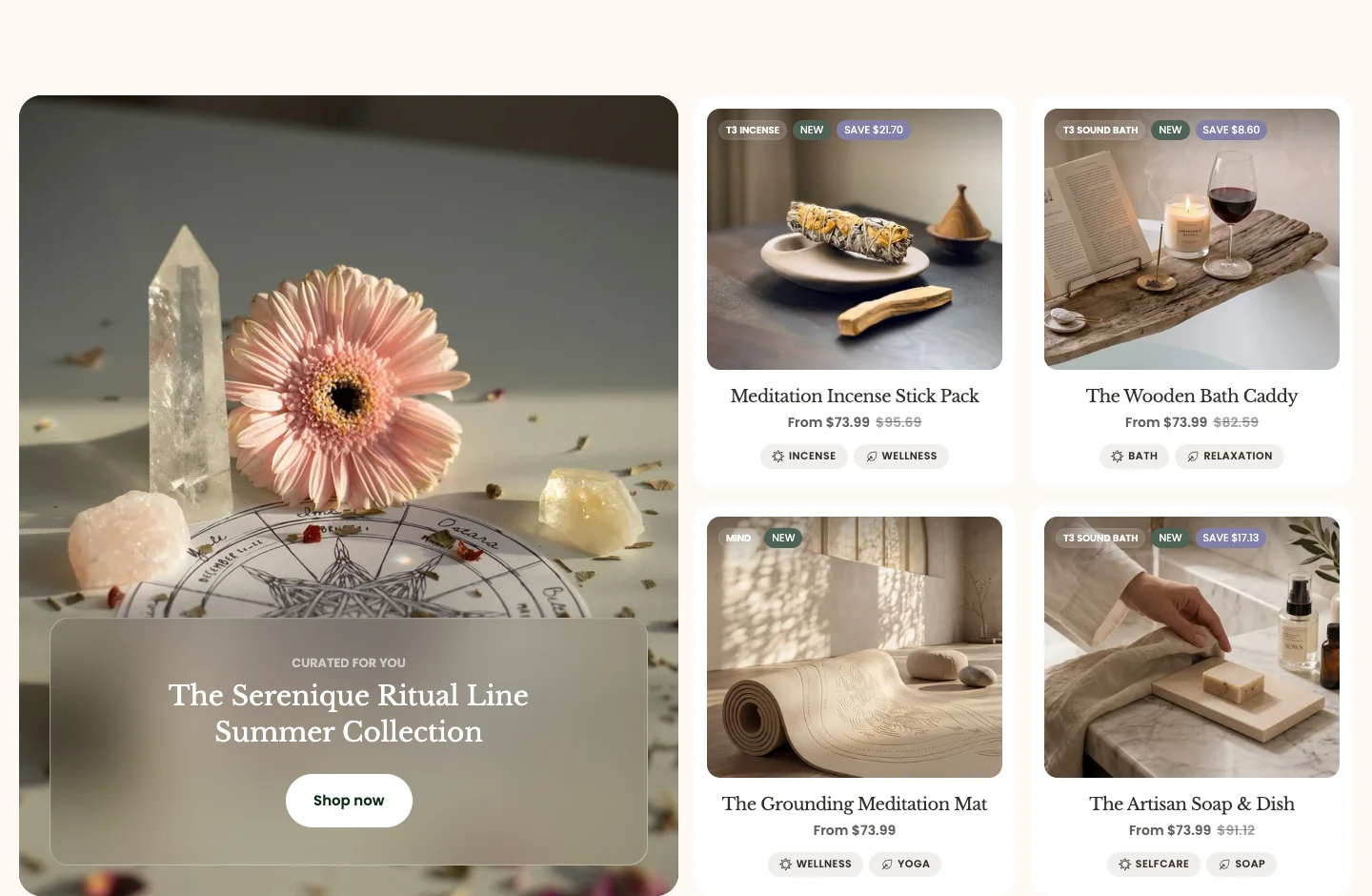
Features:
- Source products from a Collection or a Products list, with Number of products to show
- Header with Sub heading, Heading, Heading size, Heading animation, and a rich text Description
- Layout: columns for desktop and mobile, with a Global or Custom gap
- Product card: Aspect ratio, Show price, and Show tag
- Blocks: Banner (one per section), with Color scheme, Banner position, Width (columns), Height (rows), a link that can open in a new tab, Sub heading, Heading, a button, desktop and mobile images, a color or gradient overlay, and Corner radius
Collection with banner
The default preset: four products with a large banner spanning two columns and two rows at the start of the grid. It appears on the fourth and fifth home page layouts.
Collection with banner: Editorial
An editorial take on the same section: a header with sub heading, heading, and description above six products, with a wide one-row banner placed third in the grid and no button.
Product scroll horizontal
A pinned row of product cards that slides sideways as the customer scrolls down the page. It appears on the default home page.

Features:
- Source products from a Collection or a Products list, with Number of products to show
- Header with Sub heading, Heading, Heading size, Heading animation, and Header max width
- Product card: Aspect ratio (including Auto) and Show price
Products scroll vertical
A free-form wall of product cards that drift, tilt, and scale as they pass through the screen while the customer scrolls, with a sticky header and a button. It appears on the second and fourth home page layouts.
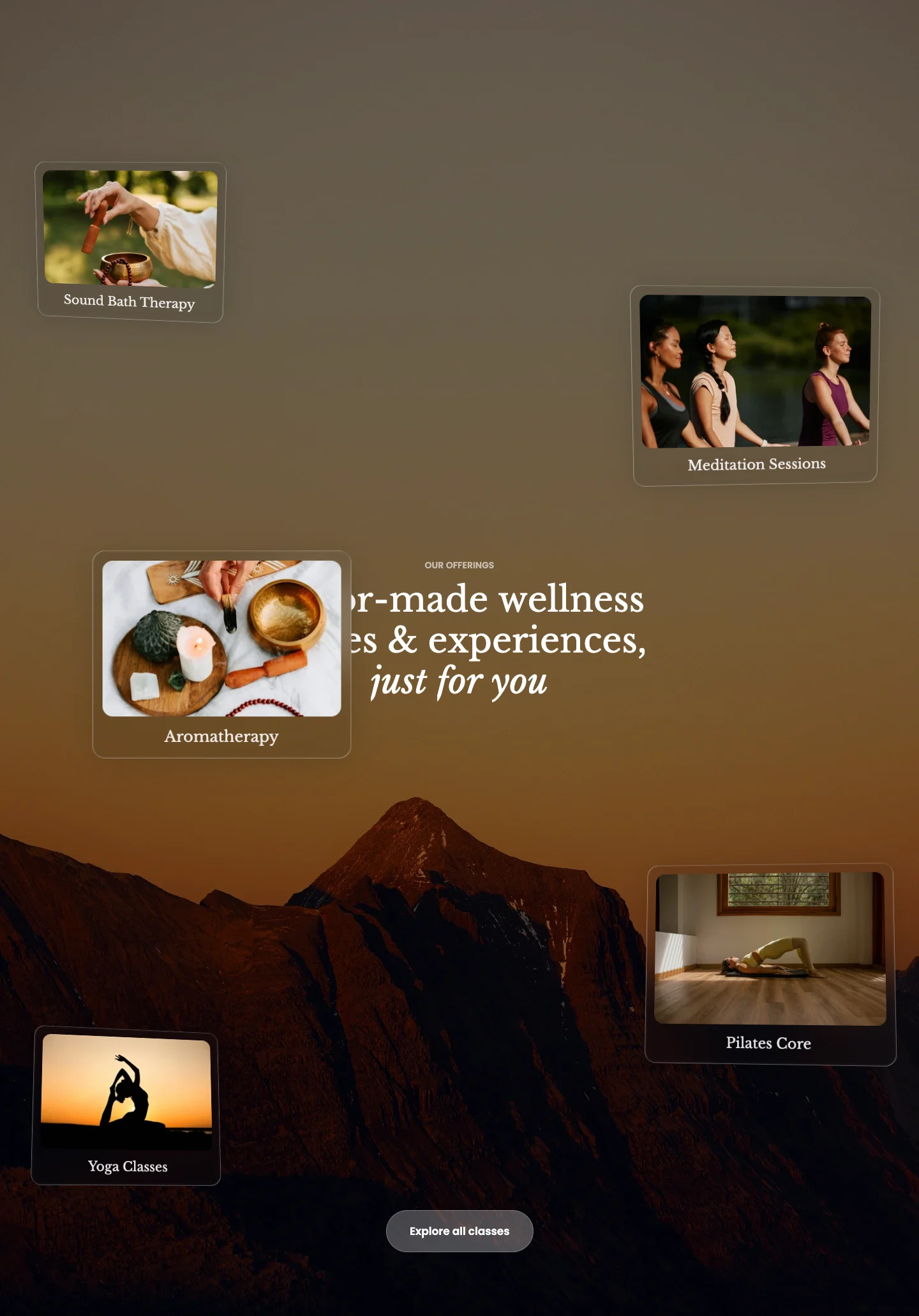
Features:
- Source products from a Collection or a Products list, with Number of products to show
- Header with Sub heading, Heading, Heading size, Heading animation, and Header max width
- Button with label, link, Button preset, Button style, and Button size
- Product card: Aspect ratio (including Auto) and Show price
Products scroll showcase
A single-column feed of large cards that move with a parallax effect as the customer scrolls, each with an image, a heading, a description, and a button. It can only be added to collection and page templates and is used by the third service collection template.
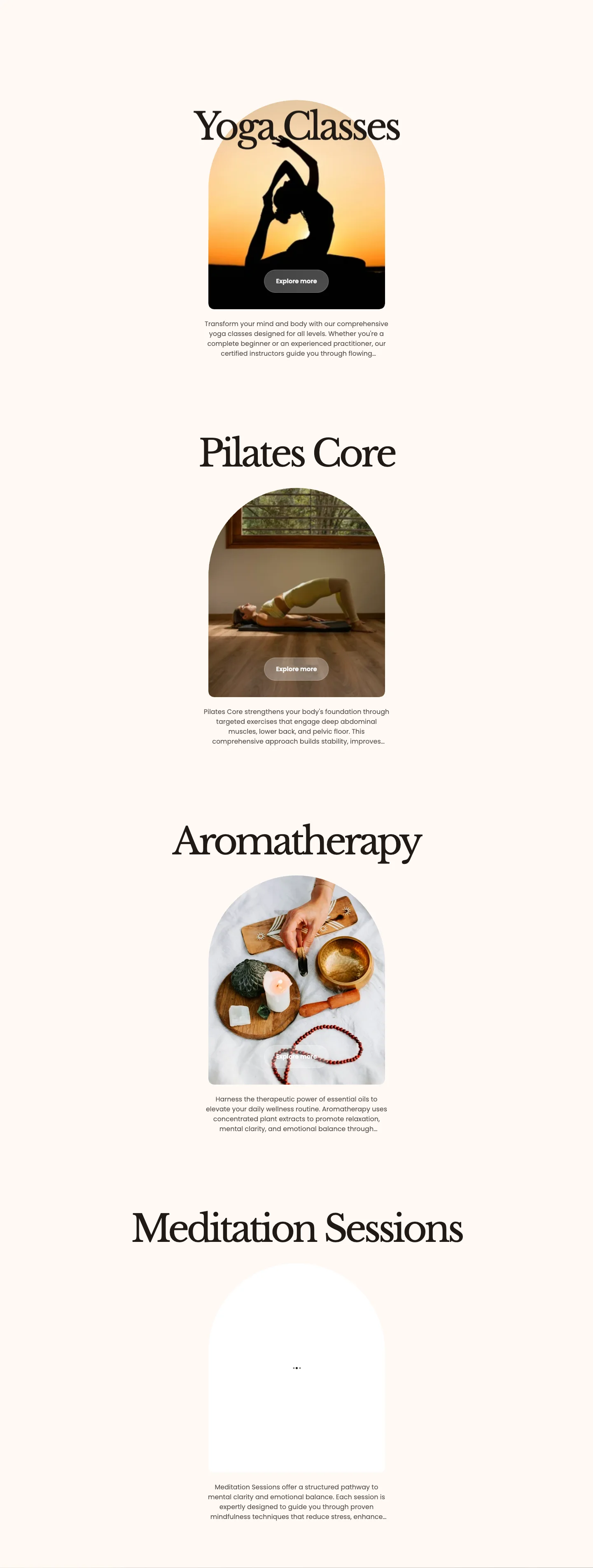
Features:
- Spacing: Global or Custom spacing between cards
- Card: Image shape (None, Arch, Arc Corner, Wavy Blob, Convex, Hourglass, Cloud, Butterfly, Petal Shield, Flower Quad, Layered Oval, or Stamp), Image aspect ratio, and Max description lines (None shows the full text)
- Button with label, Button preset, Button style, and Button size
- Blocks: Card (Image, Heading, Link, and Description you write yourself) and Product (pulls the image, title, and description from a product)
Products showcase
A gallery of product cards and images arranged in a masonry or scattered layout. Use it for a curated, editorial product edit.
section-products-showcase.webp
Features:
- Header with Sub heading, Heading, Heading size, Heading animation, and Header max width
- Layout: Masonry or Scattered
- Show price and Show description on product cards
- Up to 10 blocks: Card (a Product with its own Aspect ratio) and Image (an Image with a Link and its own Aspect ratio)
Stacked cards slider
A deck of stacked cards that the customer flips through with previous and next buttons. It appears on the default home page and several alternate home page layouts.

Features:
- Source products from a Collection or a Products list, with Number of products to show
- Style: Top stack, Right stack, Left stack, Angled stack, or Orbit
- Card content: Product card or Image with caption
- Header with Sub heading, Heading, Heading size, Heading animation, and Header max width
- Product card: Product card color scheme, Aspect ratio, Show price, and Show description
- Navigation: Show navigation and Navigation color scheme
Product tabs
A header above a set of tabs, each opening a panel with its own heading, text, and image. Use it to explain product features, ingredients, or care steps one topic at a time.
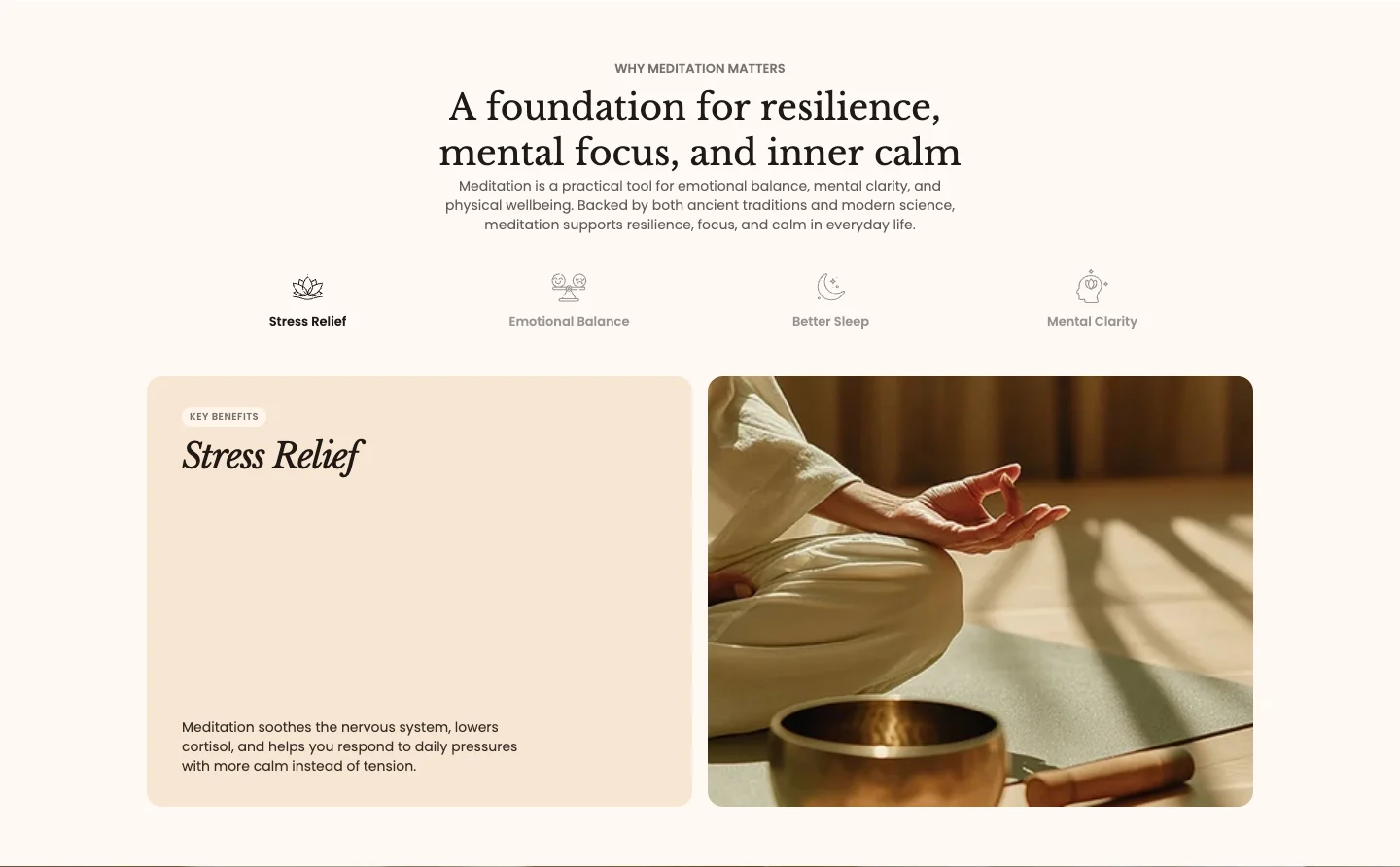
Features:
- Header with Sub heading, Heading, Heading animation, and a rich text Text
- Blocks: Tab, each with an Icon image and Tab label, plus a Panel label, Panel heading, Panel text, and Panel image
Product compare
A product grid or carousel where every card has a Compare action. Customers add products to their comparison list and a message confirms each addition or removal; the list opens in the Product compare modal.
section-product-compare.webp
Features:
- Source products from a Collection or a Products list, with Number of products to show
- Cards layout: Grid or Carousel, with Carousel on mobile, columns for desktop and mobile, and a Global or Custom gap
- Header with Sub heading, Heading, Heading size, Heading animation, and a rich text Description
- Product card: Aspect ratio and Show price
- The Compare action always shows on this section's cards, whatever the Show compare theme setting is
Related products
Shopify's related-products row for the product being viewed. It can only be added to product templates and appears on every product template that ships with Mind.
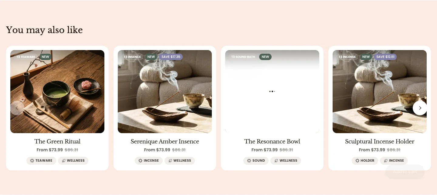
Features:
- Number of products to show
- Header with Heading, Heading size, and Heading animation
- Layout: Grid or Carousel, with columns for desktop and mobile and a Global or Custom gap
- Advanced carousel: Speed, Autoplay with a Custom autoplay interval, Loop, and Overflow hidden (All, Desktop, or Mobile)
- Product card: Card style (Global or Glassmorphism), Aspect ratio, Show price, Show description, Show properties on the image, and Show tag
Recently viewed
A row of the products the visitor has looked at most recently in this browser. It can be added to product and page templates and is used by the Recently viewed page template.
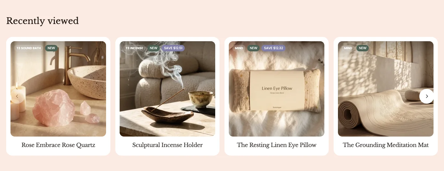
Features:
- Number of products to show
- Header with Heading, Heading size, and Heading animation
- Layout: Grid or Carousel, with columns for desktop and mobile and a Global or Custom gap
- Advanced carousel: Speed, Autoplay with a Custom autoplay interval, Loop, and Overflow hidden
- Product card: Aspect ratio, Show price, and Show tag
Cart mini
The cart drawer that slides in when a customer adds a product or opens the cart icon. It lives in the Overlay section group; its main behavior comes from Online Store > Customize > Theme settings > Cart.
section-xo-cart-mini.webp
Features:
- Cart drawer suggestions: a Products list shown as suggestions inside the drawer
- Blocks: Promotion card, each with an Image, Width (Half or Full width), Alignment (Left or Center), Sub heading, Heading, a Badge text with a Badge color, and a button or link with Label and Link
- From Theme settings: Cart type (Drawer, Page, or Popup notification), Drawer position, Color scheme, Show cart note, Show cart discount, Redirect to Cart page, and Show free shipping message with a Free shipping threshold
See Theme Settings for the full Cart group, and the Free shipping and Cart attributes guides.
Quick view
The panel that opens when a customer adds a product with several variants from a product card, so they can choose options without leaving the page. It lives in the Overlay section group.
section-quick-view.webp
Features:
- Preset: Drawer or Modal, with a Placement of Left or Right
- General settings: Global (follows the Modal and Drawer groups in Theme settings) or Custom
- Custom settings: Inherit color scheme or pick a Color scheme, Padding desktop, and Padding mobile
- Advanced: Animation type, Easing, Duration, Backdrop opacity, and Backdrop blur
The theme code also contains two sections named Quick view (quick-view-content) and Quick view bundle (quick-view-content-bundle). They are internal: they render the product gallery, price, variant picker, and add-to-cart inside the quick view panel, the second one when the product is opened from a bundle. They have no settings, and you do not add them to pages.
Product compare modal
The comparison overlay opened from the Compare action on product cards. It lives in the Overlay section group and shows the customer's chosen products side by side.
section-product-compare-modal.webp
Features:
- List compare rows toggled individually: Available, Type, Price, Vendor, SKU, Tags, and Variants
- Custom metafields to add your own comparison rows. See Product metafield data
- Turn on the Compare action on product cards with Show compare in Online Store > Customize > Theme settings > Product cards
Featured collection, Product compare, Related products, and Recently viewed share the same Grid or Carousel layout controls. Keep the Product card aspect ratio and toggles consistent across sections so cards look the same wherever they appear. For a more animated row, try Product scroll horizontal, Products scroll vertical, or Stacked cards slider.