Content Sections
Content sections carry the informational parts of your store: text blocks, benefit lists, FAQs, contact details, newsletter sign-ups, and blog teasers. Mind includes 15 content sections. Every one of them shares the universal color scheme, background, and padding controls described in Section Settings, so this page only lists what is specific to each section.
Most content sections include a Heading animation setting. Choose Global to follow your theme settings, Scroll to animate the heading as it scrolls into view, or Reveal to reveal it line by line.
Rich text
A flexible text section made of columns, each with its own sub heading, heading, and body copy. Use it for brand statements, policy summaries, or any free-form text.
section-rich-text.webp
Features:
- Columns with a sub heading, heading, and rich text body
- Column width per column (1 to 12 of a 12-column grid on desktop); columns stack on mobile
- Top and bottom padding per column, for desktop and mobile
- Blocks: Column
Multi column
A heading above a row of columns, each with an image, a heading, and text. It appears on the second and third home page layouts.
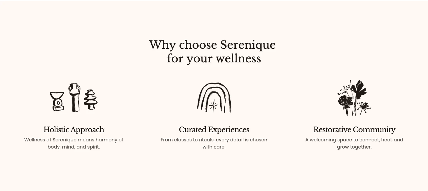
Features:
- Heading with heading size and animation
- Grid or Carousel layout, with an option to switch to a carousel on mobile only
- Columns per row and gap (Global or Custom) for desktop and mobile
- Columns with an image, heading, and text
- Blocks: Column
Benefit columns
A heading above a row of short benefit statements, each with a label and a description.
section-benefit-columns.webp
Features:
- Heading with heading size and animation
- Columns with a label and rich text
- Blocks: Column
Icon features
A centered header followed by a row of icon-led feature statements. It appears on the fifth home page layout.
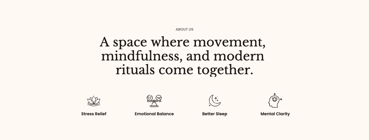
Features:
- Sub heading and heading, with heading size, animation, and header max width
- Features with your own icon image and a short text
- Blocks: Feature
Text with icons
A heading followed by a row of pills, each pairing a built-in icon with a short benefit. It appears on the third home page layout.

Features:
- Heading with heading size, animation, and header max width
- Pills with a built-in icon (None, Leaf, Star, Sun, Heart, Energy, Strength, or Check) and a text
- Blocks: Pill
Scrolling text
A continuous marquee of words and small images that runs across the full width of the page. Use it as a divider between sections or to repeat a tagline.

Features:
- Direction (Forward or Backward), speed, and pause on hover
- Word spacing for desktop and mobile
- Words with rich text, so you can style individual words
- Images with a height and corner radius, placed between words
- Blocks: Word, Image
Collapsible content
A heading above a list of collapsible rows, set on an optional background image. It is used by the product.product-2 template to hold extra product details.
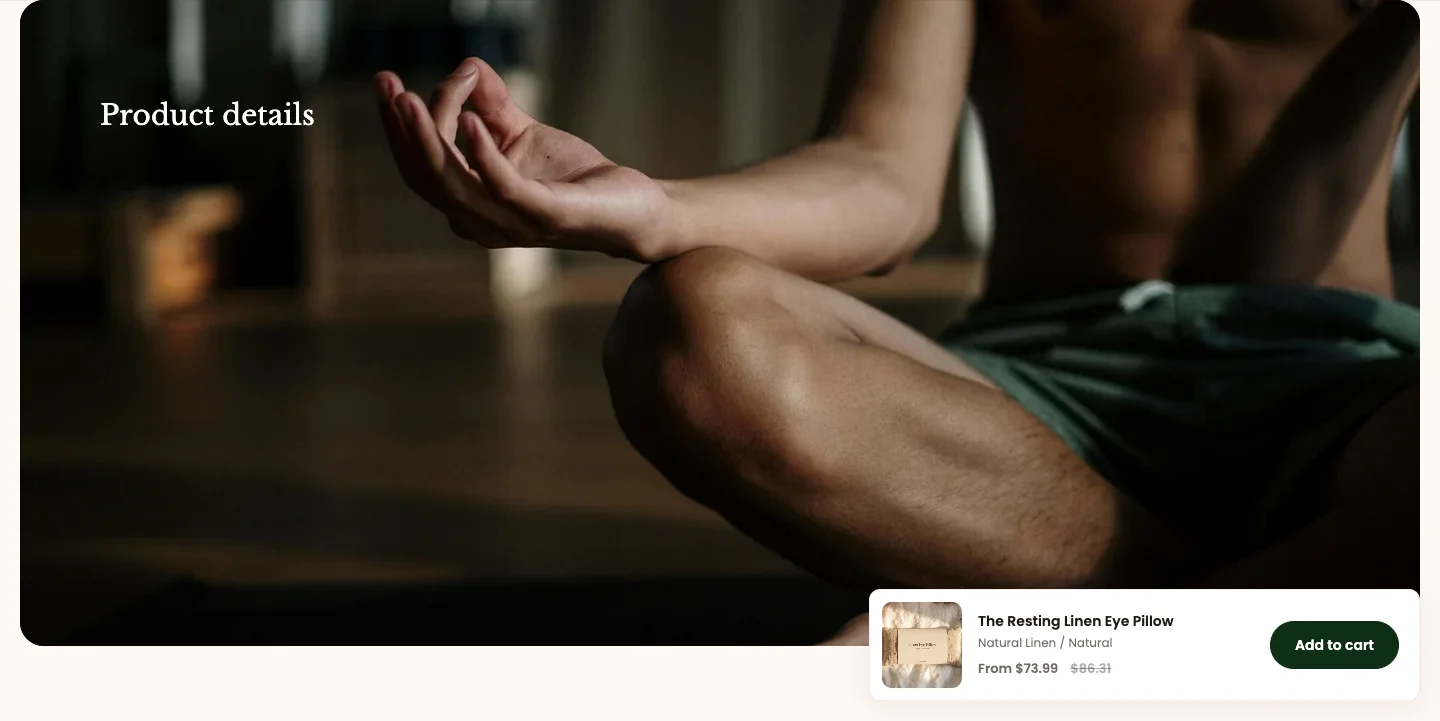
Features:
- Heading with heading size and animation
- Background image behind the content, with an overlay color
- Card colors and corner radius for the rows
- Rows with a title, rich text content, and an Open by default option
- Blocks: Row
Collapsible showcase
A header above a list of expandable items, paired with an image or a video. Each item can list highlights and link to a page, which makes it a good fit for presenting the steps of a service or the pillars of your approach.
section-collapsible-showcase.webp
Features:
- Sub heading and heading
- Items with a heading, description, highlights, link text and link, and an Open by default option
- Image with aspect ratio (Auto, 3:4, 1:1, 4:3, 16:9, or Custom) and corner radius
- Video, uploaded or from an external URL, with a cover image, loop, autoplay, controls, alt text, aspect ratio, and corner radius
- Play button with its own color scheme, icon size, width, and height
- Blocks: Item, Image, Video
FAQs
A heading and description beside a list of questions and answers, with an optional button that links to your full FAQ page. It is used by the page.contact template.
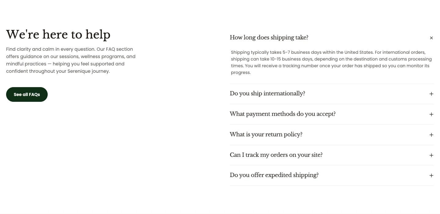
Features:
- Heading with heading size and animation, and a rich text description
- Button with label, link, preset, style, and size
- Questions with a rich text answer and an Open by default option
- Blocks: FAQ
Feature tabs
A header above a set of tabs. Each tab opens a panel with an image, a heading, and a description, so you can walk shoppers through several features without a long page.
section-feature-tabs.webp
Features:
- Sub heading and heading with heading size
- Panel image ratio (width and height)
- Tabs with a tab label and a panel image, heading, and description
- Blocks: Tab
Contact
A contact form card with a list of contact details, with an optional hero header above it. It is used by the page.contact template.
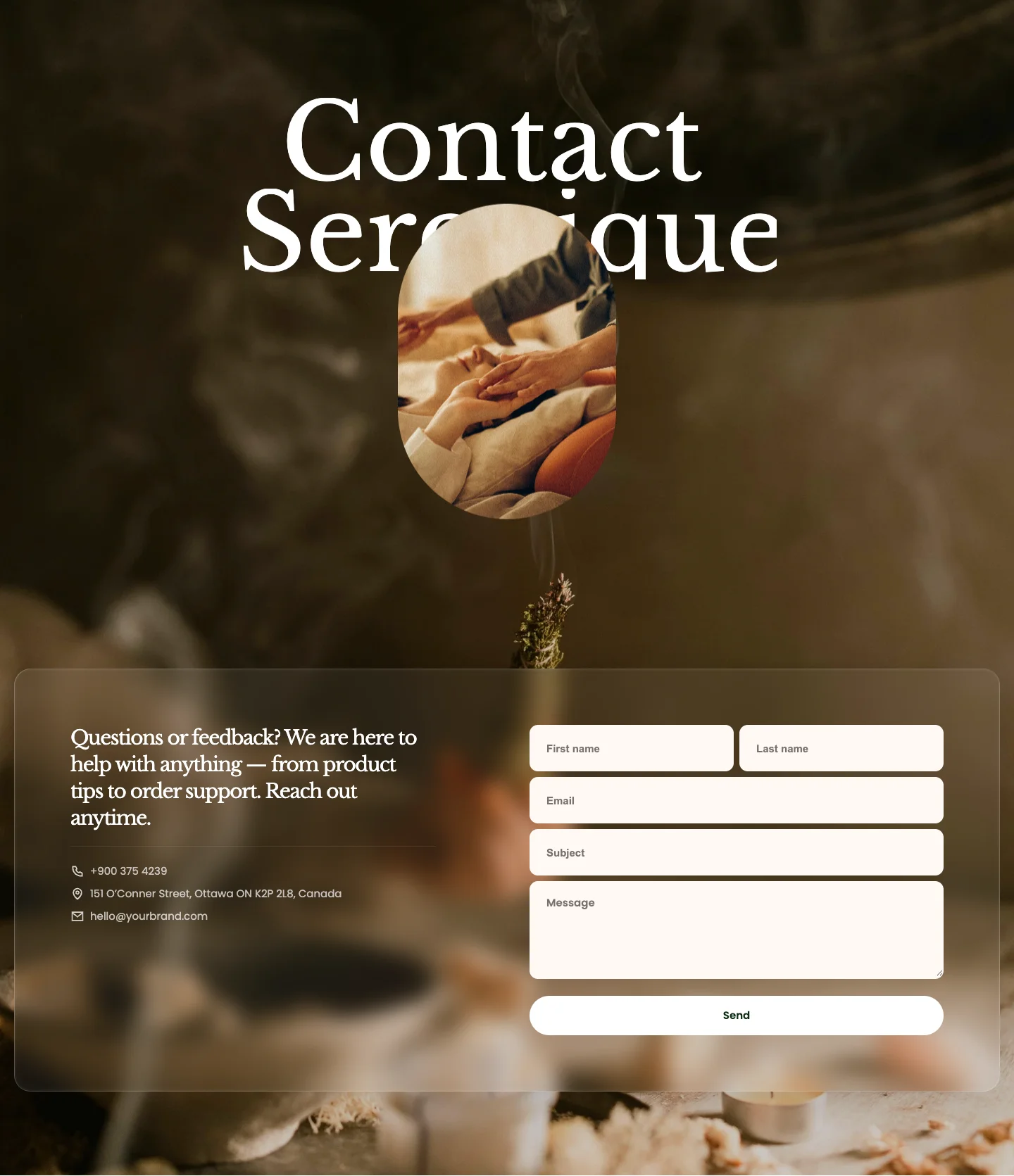
Features:
- Heading with heading animation
- Optional hero above the card: Portrait or Banner layout, a hero heading, and a hero image (leave it empty to hide it)
- Card style (Glass or Solid), card colors, and corner radius
- Submit button with label, preset, style, and size
- Uses the Shopify contact form, so messages arrive in your store's email
- Contact items with an icon (Phone, Phone call, Location, or Mail) and a text
- Image background type in addition to Color and Gradient
- Blocks: Contact item
Store locator
An embedded Google map of your store's address, shown with a card that holds the store name, opening hours, and contact details. It is used by the page.contact template.
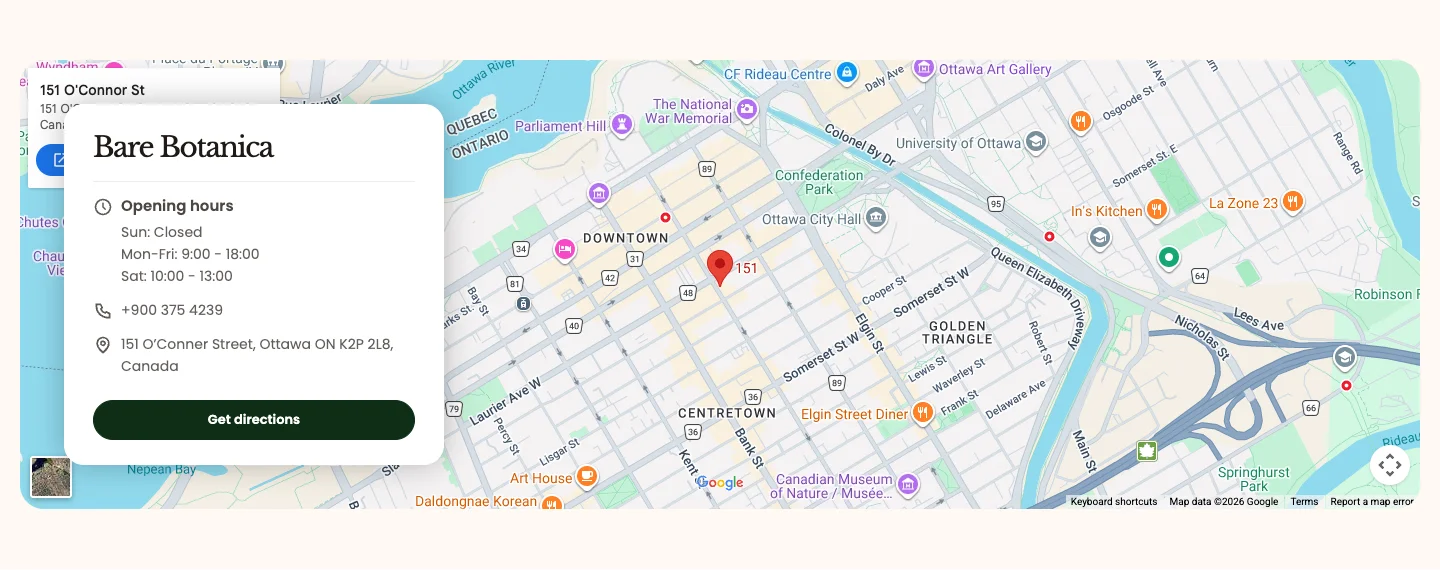
Features:
- Heading (the store name) and address, which sets the map location
- Map type (Road map or Satellite) and zoom level
- Card colors and corner radius
- Button with label, link, preset, style, and size, for example a "Get directions" link
- Info items with an icon (Clock, Phone, Location, or Mail), a label, and rich text content
- Blocks: Info item
Newsletter banner
A newsletter sign-up form over a background image, with a scrolling marquee of text at the top or bottom.
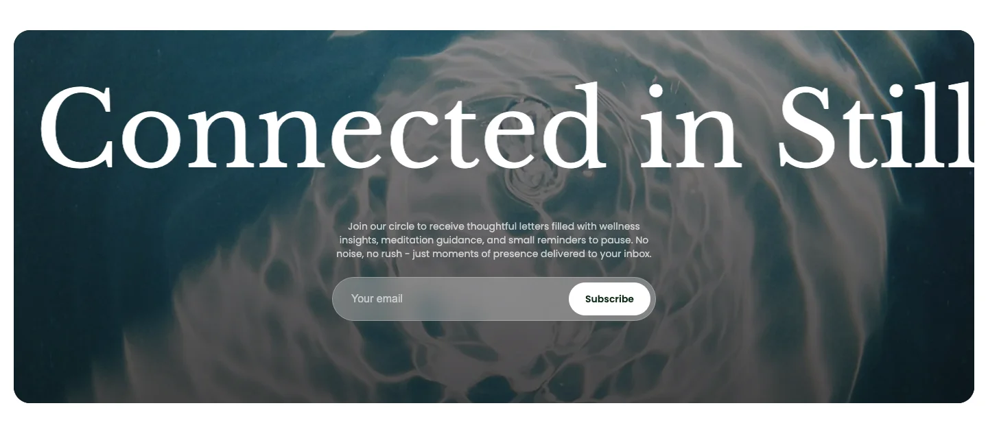
Features:
- Content color scheme, content position (Top or Bottom), and a rich text intro above the sign-up form
- Background image with corner radius and overlay color
- Marquee direction, speed, pause on hover, and sync with page scroll
- Item spacing for desktop and mobile
- Blocks: Text
Newsletter image slider
A newsletter sign-up with a header and a continuously scrolling row of images.
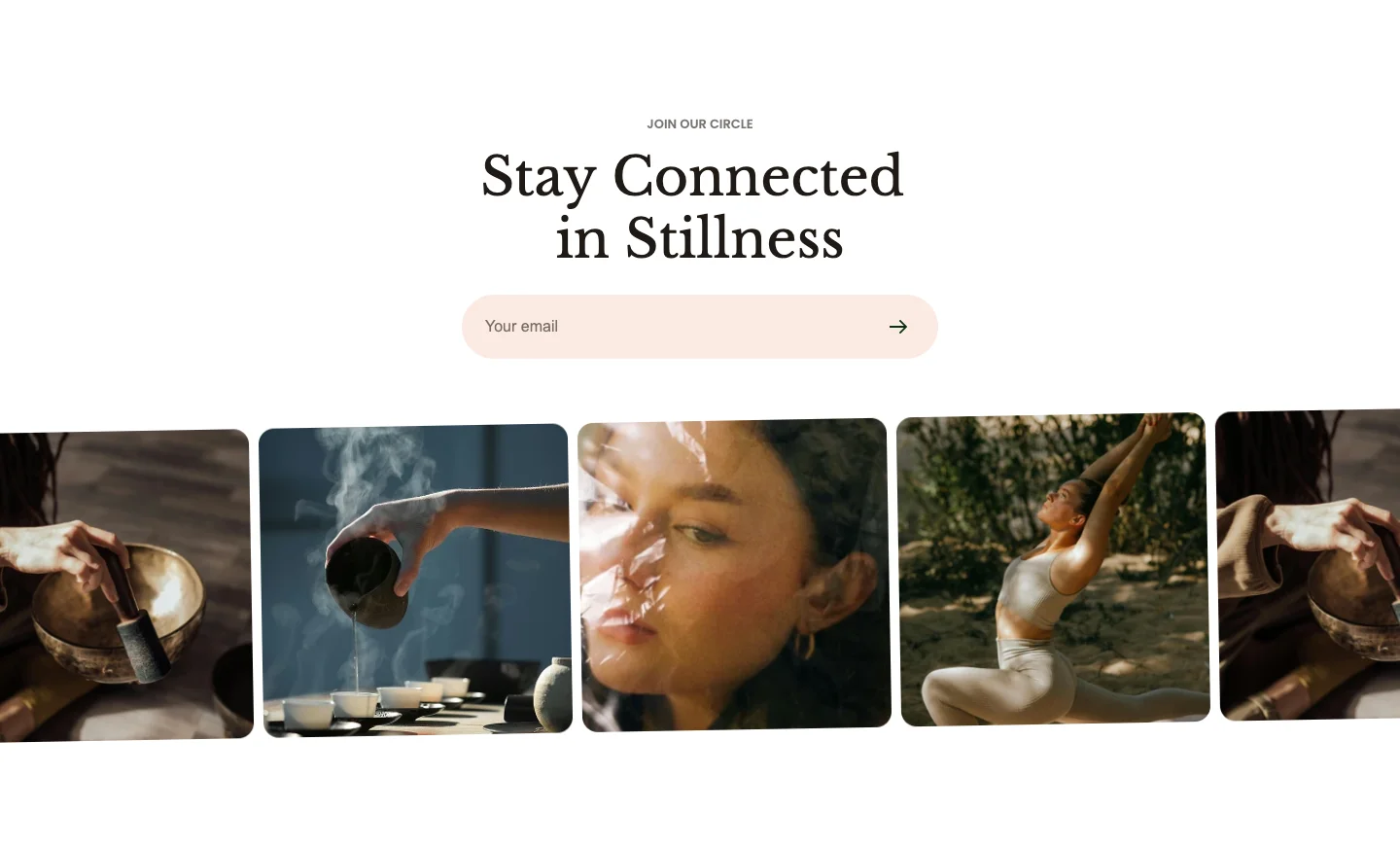
Features:
- Sub heading and heading with heading size and animation
- Newsletter sign-up form
- Marquee direction, speed, pause on hover, and sync with page scroll
- Item spacing for desktop and mobile
- Blocks: Image
Blog post
A heading and an optional "view all" button above a grid or carousel of article cards. It is used by the article template to suggest further reading.
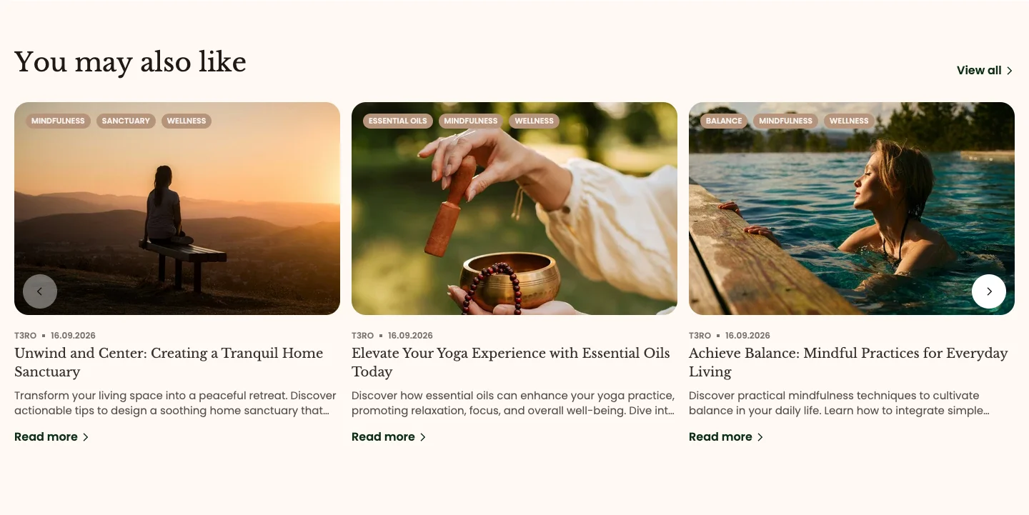
Features:
- Blog picker and number of articles to show (up to 20)
- Articles picker to hand-pick posts; when you select articles, they replace the blog's latest posts
- Heading with heading size and animation
- Grid or Carousel layout, carousel on mobile, columns and gap for desktop and mobile
- Button with label, link, preset (including Underline out and Underline in), style, and size
- Article card aspect ratio (3:4, 1:1, 4:3, 16:9, or Custom)
- Show date, author, tags, and description toggles
- Put FAQs, Contact, and Store locator together on your contact page, as the
page.contacttemplate does. - Use Scrolling text between two image-heavy sections to add rhythm to your home page.
- Choose Newsletter banner for a single strong image, and Newsletter image slider to show several lifestyle images behind your sign-up form.